Lessons from Real Brands
When someone lands on your website, you have less than 10 seconds to prove two things:

- They’re in the right place.
- You can give them what they want without friction.
That’s the power of UX (User Experience) and UI (User Interface). Done right, these two disciplines don’t just make a site look polished—they directly influence sales, trust, and long-term engagement. Done poorly, they can cause visitors to click away, even if your product or service is outstanding.
At ShiverMedia, we work with travel, lifestyle, and creative brands that live and die by how well their digital presence converts. In this article, we’ll break down why UX/UI is essential, using four real-world examples:
- LaHabnb.com (hospitality brand with clean, clear navigation).
- PuertaalCieloIsla.com (a vacation rental site in progress).
- SamiMartin.com (a personal brand hub).
- TurquoiseTidesTravel.com (a travel content and booking site).
We’ll also connect these examples to established design research from sources like Nielsen Norman Group, Baymard Institute, Moz, and Google’s UX Playbook.
By the end, you’ll know exactly what makes a website not just attractive, but effective.
UX vs UI: The Basics You Can’t Ignore
Let’s clarify the difference up front:
- UX (User Experience) = How a website works. Navigation, flow, accessibility, performance, and logic.
- UI (User Interface) = How a website looks. Typography, colours, buttons, spacing, and overall aesthetic polish.
Think of UX as the skeleton and UI as the skin. You need both. Great UI on bad UX is like painting a house with broken stairs—nobody can get inside. Great UX without UI is like a barebones wireframe—functional, but uninspiring.
As Smashing Magazine puts it:
“Design is not just what it looks like and feels like. Design is how it works.”
Case Study 1: LaHabnb.com — Navigation and Brand Alignment
LaHabnb is a hospitality brand that leaned hard into its identity and clarity. From the first click, it’s obvious what the site is about: hospitality, rooms, and services are easy to find.
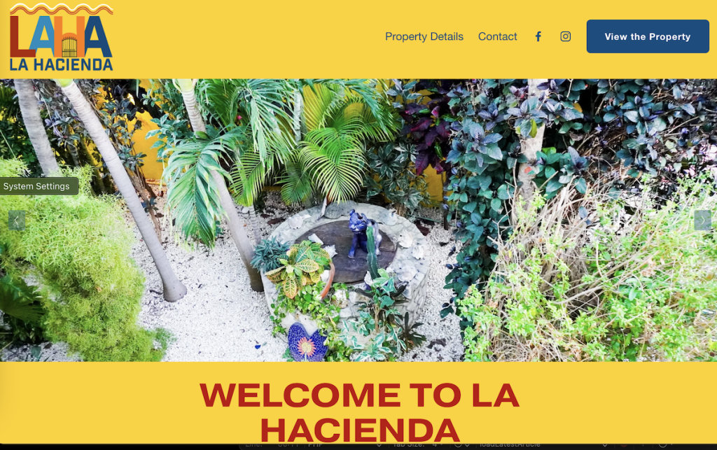
Why It Works
- Navigation clarity: Menus are simple and intuitive. Visitors don’t need to hunt.
- UI consistency: Colours, fonts, and spacing reflect the brand without clutter.
- Content hierarchy: Headings and imagery guide the eye in the right order.
The UX Lesson
According to Nielsen Norman Group, “visibility of system status” and “match between system and real world” are critical heuristics. LaHabnb nails this by matching its digital environment to the physical hospitality experience.
If users can’t find a room in two clicks, they won’t book. LaHabnb proves that less is more—simplicity wins.
Case Study 2: PuertaalCieloIsla.com — Iterative UX in Action
Puerta al Cielo is a boutique vacation rental property in Isla Mujeres. Right now, the site is a work in progress—but that’s exactly why it’s a valuable example.

What’s Happening
- UI polish is being refined: Fonts and image treatments are aligning to the property’s luxury vibe.
- UX flow is under construction: Booking flows, CTAs, and property details are being streamlined.
- Consistency is being enforced: Ensuring the brand “feels” the same on every page.
The UX Lesson
UX isn’t a one-time project—it’s iterative. The Baymard Institute shows that nearly 70% of users abandon carts, often due to poor flow or friction in the checkout process. For Puerta al Cielo, improving this flow is the key to higher conversions.
The takeaway? Websites evolve. A work-in-progress site isn’t a failure; it’s a chance to test, refine, and align with real user behaviour.
Case Study 3: SamiMartin.com — Personal Brand Meets Accessibility
Unlike Puerta al Cielo, SamiMartin.com is complete and represents exactly how a creator wants to be seen: clean, passionate, and professional.
What Works
- Accessibility-first design: High-contrast typography, simple layouts, and responsive design ensure readability across devices.
- UI as brand reflection: The site’s fonts, colours, and imagery represent both creative and professional sides of the brand.
- UX for engagement: Easy navigation between services, blog posts, and digital downloads.
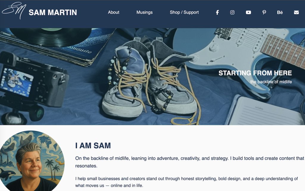
The UX Lesson
Accessibility isn’t optional. As WebAIM explains, contrast, font size, and responsive design expand your audience by including users of all ages and abilities.
SamiMartin.com demonstrates how a personal site can model UX/UI best practices for business brands. By prioritizing accessibility, it sends a message of inclusivity while making sure no user drops off due to poor readability.
Case Study 4: TurquoiseTidesTravel.com — Trust and SEO by Design
Turquoise Tides Travel is a travel-advisor and content hub. Unlike the others, it has a unique challenge: trust and SEO.
What Works
- Fast load times: Speed is a UX feature, and this site is optimized for performance.
- SEO-friendly structure: Clear categories for destinations, activities, and blog posts.
- Conversion alignment: Booking flows connect directly with affiliate partners like Viator.
The UX Lesson
UX and SEO are deeply connected. As Moz notes, Google’s ranking system prioritizes websites with strong user signals (time on page, low bounce rates, mobile responsiveness).
TurquoiseTidesTravel shows that UX/UI isn’t just about visuals—it’s about infrastructure that makes SEO and sales possible.
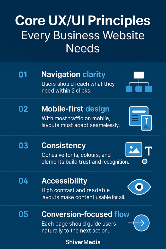
Core UX/UI Principles Every Business Website Needs
Drawing from these case studies, here are the five pillars that consistently drive results:
- Navigation clarity → Make sure customers can find anything in 2 clicks or less.
- Mobile-first design → 60%+ of web traffic is mobile. Your design must adapt.
- Consistency → Fonts, colours, buttons, and imagery must feel aligned.
- Accessibility → Meet contrast and readability standards.
- Conversion-focused flow → Always ask: what’s the next step for the user?
Supporting resource: Google’s UX Playbook.
SEO and UX: Why They’re Linked
Google doesn’t just index words; it measures experience signals like:
- Core Web Vitals: loading speed, interactivity, and stability.
- Mobile usability: Does the site work on small screens?
- Dwell time: Do people stick around or bounce?
Good UX/UI helps you win in SEO. Internal linking, clear headings, and logical flow make both users and search engines happy.
Supporting resource: Google Search Central UX Guide.
How to Audit Your Own Website UX/UI
Not sure if your site is performing? Run a quick UX/UI audit:
- Can a user find your main service in 2 clicks?
- Do buttons look consistent across the site?
- Is text readable on both desktop and mobile?
- Does your checkout/booking process feel smooth or clunky?
Tools to help:
- Hotjar → heatmaps and recordings.
- Google Analytics → bounce rates and flow.
- WebPageTest → site performance.
- WebAIM Contrast Checker → accessibility.
Conclusion: UX/UI Is a Living Investment
Great websites are never “done.” They evolve with your business, your brand, and your audience’s expectations.
- LaHabnb.com shows the power of clean navigation.
- PuertaalCieloIsla.com demonstrates the value of iteration.
- SamiMartin.com proves accessibility and brand reflection build trust.
- TurquoiseTidesTravel.com ties UX/UI directly to SEO and conversions.
Your website isn’t just a digital business card—it’s your most powerful sales tool. UX and UI decide whether it works for you or against you.
At ShiverMedia, we help small businesses and creators build sites that don’t just look good—they convert, engage, and grow with your goals.