Why Brand Consistency Matters: From Your Logo to Your Colours, Fonts, Website, Packaging, and Everything in Between
Branding isn’t decoration.
It’s not just a logo, or a colour you “like,” or a font that looked nice in the moment.
Branding is the visual and emotional language your audience learns to recognise you by. It’s the identity system that tells people who you are before you ever speak. When done well, it builds trust, improves recall, and positions your business as credible, stable, and worth choosing. When done poorly, it creates doubt — and doubt is the number one killer of conversions.
For small businesses, creators, travel brands, restaurants, real estate rentals, and service-based companies, brand consistency isn’t optional. It determines how people feel about you, how they perceive your professionalism, and ultimately whether they want to work with you.
This article breaks down why consistency matters, how your visual choices affect perception, and the powerful difference between a cohesive brand and a scattered one. You’ll also see real-world examples — including brands I’ve designed and a brand using a completely misaligned logo — that illustrate exactly what works and what doesn’t.
Let’s start with the basics.
What Brand Consistency Actually Is — and Why It Matters
Brand consistency is the intentional, disciplined use of:
- Logo
- Colour palette
- Typography system
- Imagery style
- Voice and tone
- Layout and spacing rules
- Website styling
- Social templates
- Printed materials
- Product or packaging design
When customers see your brand anywhere — YouTube thumbnail, website, business card, Instagram post, Airbnb listing, product label — they should instantly know it’s you.
Consistency builds:
- recognition
- trust
- professionalism
- stability
- loyalty
Inconsistency creates confusion — and confusion kills conversions.
Your Logo: The First Emotional Trigger
Customers form an impression of your business in a fraction of a second. That impression starts with your logo.
A great logo communicates:
- professionalism
- personality
- industry fit
- tone (luxury, relaxed, fun, corporate, natural, modern, etc.)
- positioning
- credibility
Before they read anything, before they compare offerings, before they scroll further — your logo sets the emotional tone.
This is why “any logo” won’t do.
A random icon, a cheap generator, or an AI-made template doesn’t consider who you are, what you offer, or what your brand feels like.
A strong logo is designed for your brand, not pulled from someone else’s aesthetic.
Colour and Shape Psychology: The Hidden Layer of Brand Consistency
Most people think branding is about what they see, but the deeper impact comes from what they feel. Colour and shapes are silent storytellers — they influence emotion, expectation, and perception long before a customer processes words or details.
These two elements must align with your business style, your environment, and your audience.
Colour: The Emotional Engine of Your Brand
Colour controls mood and first impressions. It sets the emotional tone before language ever enters the picture.
Blues
Trust, calm, confidence.
Greens
Nature, freshness, organic energy.
Reds
Excitement, urgency, appetite.
Yellows
Warmth, optimism, friendliness.
Turquoise & Aquas
Tropical, refreshing, uplifting — ideal for travel and coastal brands.
Neutrals
Timelessness, sophistication, minimalism.
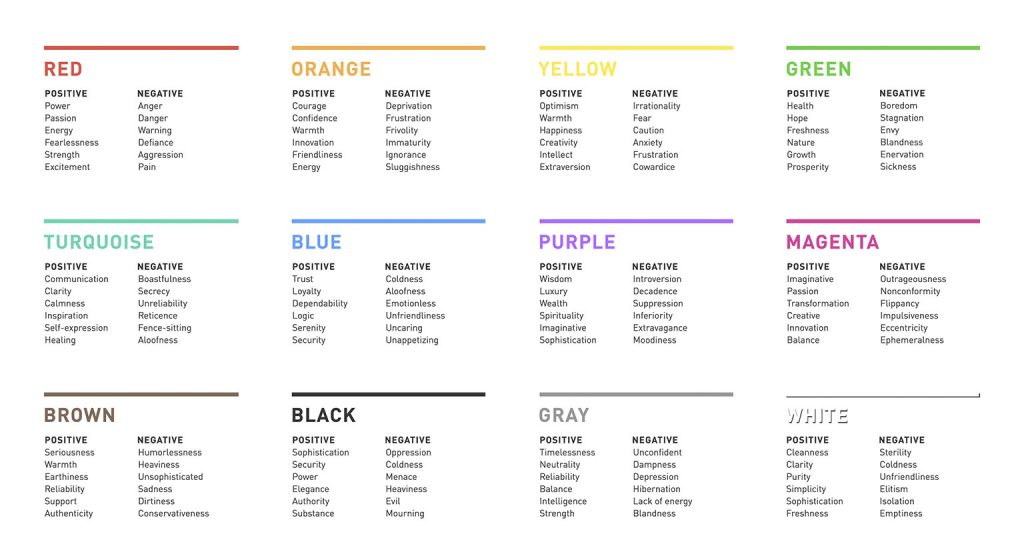
Colour must match the brand’s emotional intention. Random colours used inconsistently create emotional noise and fracture trust.
Shapes: The Personality Behind Your Logo
Shapes define the structure and emotional tone of your identity.
Rounded shapes
Friendly, soft, human.
Rectangles / Straight lines
Professional, steady, secure.
Triangles / Angles
Dynamic, bold, directional.
Organic shapes
Natural, calming, expressive.
Geometric shapes
Premium, controlled, modern.
When shape psychology and business personality don’t align, customers feel a mismatch — even if they can’t articulate why.
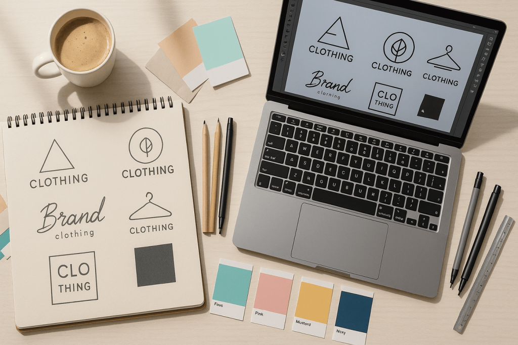
Your Logo Must Work Everywhere (Across Backgrounds, Formats, Media)
A serious brand needs a logo system, not a single file. Your logo must function on:
- light backgrounds
- dark backgrounds
- solid colours
- gradients
- signs
- digital screens
- thumbnails
- embroidery
- profile images
- horizontal banners
- vertical layouts
If a logo breaks when scaled down, inverted, or placed on colour, it’s not a functional identity.
Professional brands require:
- a primary logo
- a secondary or horizontal version
- a stacked version
- an icon or monogram
- a one-colour version
- a reversed version
Customers should recognise your brand from the icon alone, even at 40px.
Typography: Your Silent Brand Voice
Fonts shape personality. They influence:
- tone
- legibility
- professionalism
- energy
- industry alignment
- trust
A mismatched or inconsistent typography system makes a brand feel unstable. A consistent system builds visual equity and emotional clarity.
Imagery Style: The Unspoken Visual Identity
Strong brands use consistent imagery:
- similar colour grading
- similar lighting
- similar composition
- similar subject matter
When your photos and graphics change drastically in style, customers feel inconsistency immediately. Imagery creates atmosphere. Atmosphere drives emotion. Emotion drives decisions.
Packaging and Product Presentation: Where the Brand Becomes Real
Packaging — whether physical or digital — is where customers touch your brand.
It includes:
- printed materials
- guides
- proposals
- onboarding packets
- product labels
- digital downloads
- templates
- presentation decks
Consistency becomes credibility.
La Hacienda / LaHabnb.com — A Rebrand That Finally Matched the Property
La Hacienda originally had a logo that didn’t reflect:
- the architecture
- the colours of the home
- the vibrant environment
- the owner’s colourful personality
- the guest experience
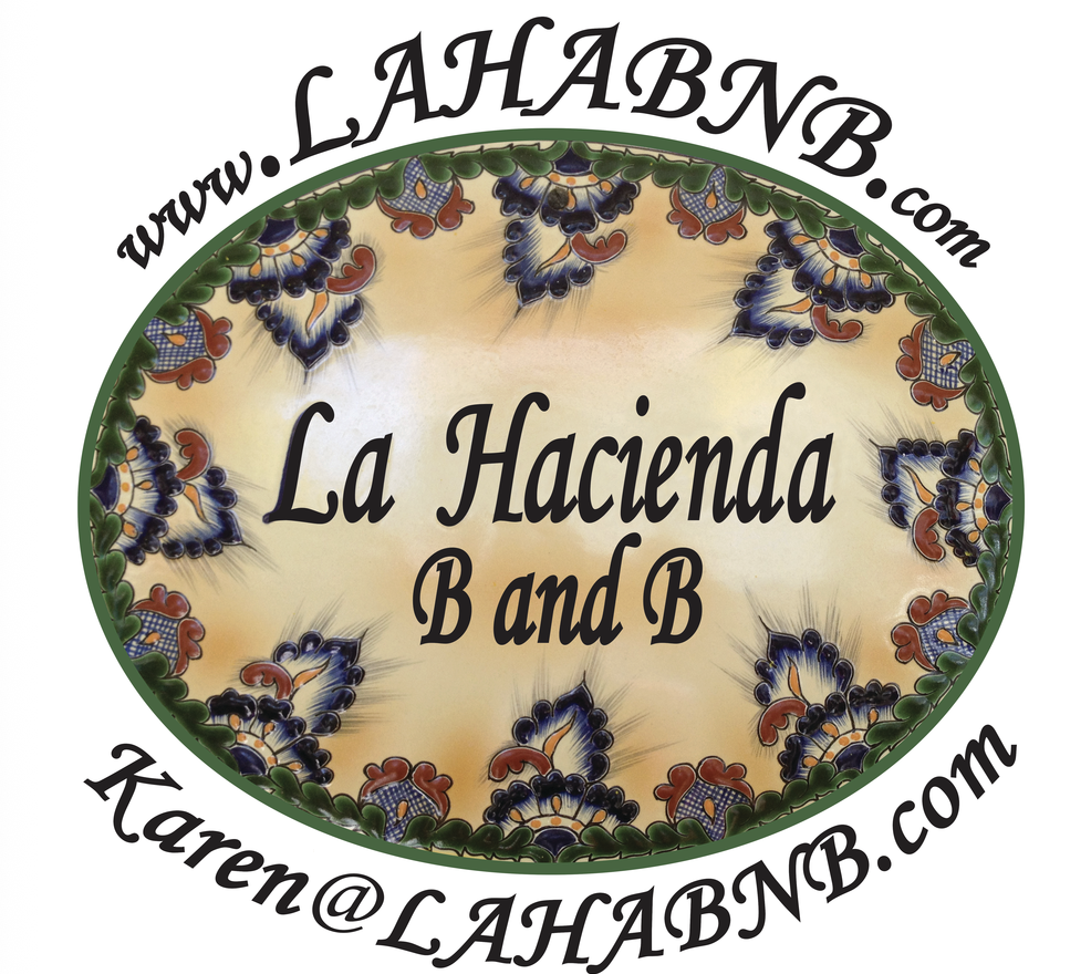
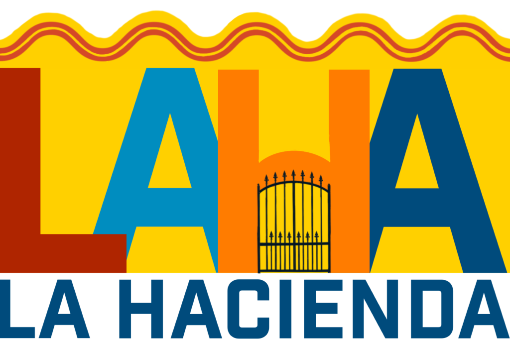
ShiverMedia redesigned their brand using:
- colours pulled directly from the home
- owner input for tone and personality
- a form language aligned with the home’s structure
- a visual system that carries across digital and print touchpoints
If these do not match the brand identity, the experience breaks.
The brand finally felt like the home — warm, colourful, inviting, tropical.
This is consistency at work.
www.lahabnb.com
Turquoise Tides Travel — Branding Built From Scratch With Intention
Turquoise Tides Travel needed a visual identity that felt:
- tropical
- modern
- trustworthy
- vibrant
- warm
- island-forward
ShiverMedia built the brand from zero:

- Caribbean-inspired palette
- clean, friendly typography
- logo movement rooted in ocean and travel
- templates for social, email, YouTube, and website
- consistent application across all media
The consistency makes the brand recognizable at a glance.
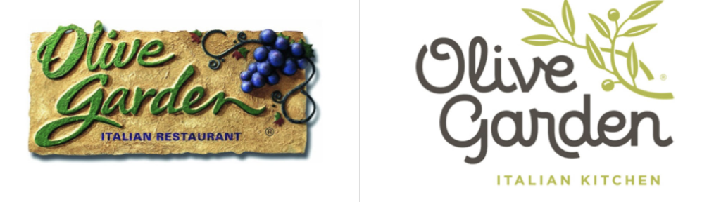
Olive Garden (2014 Rebrand) — A Garden Restaurant With a Logo That Missed the Mark
This is the single strongest real-world example of a “garden restaurant” logo that was widely criticized for not matching the brand’s vibe.
Minimalism over Atmosphere: The stripped-down script + branch doesn’t evoke the sensory cues of a warm, rustic Mediterranean villa — no rough textures, no stone walls, no grape vines or natural shadows.
Generic Feel: Because it’s flat, clean, and minimal, many people feel it could belong to a tech startup or a boutique design firm — not a family-style Italian-American eatery.
Mismatch with Expectation: For a restaurant named “Olive Garden” — which evokes images of olive trees, vineyards, fresh produce, and textured Mediterranean architecture — the current logo’s simplicity feels disconnected from the sensory and emotional expectations tied to those words.
Reflects:
- A modern, streamlined, minimal aesthetic.
- Easy reproduction across signage, print, digital — more scalable than ornate old logos.
- Clarity and readability at small sizes or from a distance.
Loses:
- Atmosphere — it doesn’t feel “garden,” “Italian,” or “warm.”
- Textural richness — no sense of earthiness, handcrafted feel, or rustic heritage.
- Emotional resonance — doesn’t visually invite warmth, family, comfort, or the Mediterranean vibe.
- minimalistic linework
- angular shapes
- monochrome palette
- culturally Japanese influence
It’s not a bad logo. It’s just the wrong logo for the business.
- If you’re a beachfront café, your logo shouldn’t look like a winery.
- If you’re a boho brunch spot, your logo shouldn’t look like a nightclub.
- If you’re a luxury dinner restaurant, your logo shouldn’t look like a kids’ craft café.
This disconnect is exactly what happens with AI-driven, template-based logo generators. They create visuals — not intention, not authenticity, not alignment.
Customers spot misalignment instantly — even if they can’t explain why.
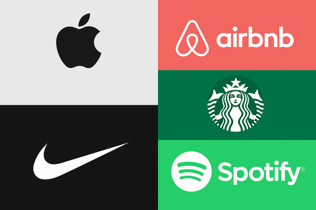
Examples of solid real workd use cases for imagery, fonts and colours.
How Customers Interpret Your Branding — Emotion Always Comes First
Customers don’t break down design logic. They feel:
- trust
- confidence
- quality
- energy
- clarity
- professionalism
Or they feel:
- doubt
- conflict
- mixed signals
- uncertainty
Emotion is the gateway. Consistency creates that emotional stability.
Designing for Your Audience — Not Just What Appeals to You
Branding is not personal décor. It’s communication.
Your branding must reflect the needs, desires, and expectations of the customer, not the personal taste of the owner.
Examples:
- A luxury rental can’t be branded with playful fonts.
- A wellness brand can’t use harsh metallics.
- A tropical café can’t use nightclub styling.
- A travel brand can’t rely on muted greys because the owner likes minimalism.
When you design for yourself, your brand becomes a reflection. When you design for your audience, your brand becomes a magnet. The key is balancing strategy first, personality second.
The Cost of Inconsistent Branding
Inconsistent branding creates:
- confusion
- low engagement
- poor recall
- weak social presence
- reduced pricing power
- lost conversions
- lack of trust
Your visuals either elevate your business or quietly destroy confidence.
How ShiverMedia Builds Consistent, High-Performing Brands
My identity development process includes:
- design strategy
- purposeful logo systems
- colour psychology
- shape psychology
- typography hierarchy
- imagery standards
- social and email templates
- website alignment
- brand hubs for easy use
The result is a brand that’s usable, scalable, recognisable, and emotionally aligned.
Final Thoughts: Consistency Is the Shortcut to Looking Premium
You don’t need more design. You need more alignment. When your brand is consistent:
- you look premium
- you feel established
- customers trust you quicker
- your pricing makes sense
- your marketing performs better
- your audience remembers you
This is how small businesses gain big business authority.
Ready to Build a Brand That Finally Matches the Quality of What You Offer?
If your brand feels mismatched, scattered, or outdated, ShiverMedia can help you rebuild it with intention, consistency, and clarity.
I specialise in:
- logo systems
- brand identity design
- consistent colour architecture
- shape + form psychology
- typography systems
- digital + print alignment
- website styling
- multi-platform visual consistency
contact @Shivermedia When You Are Ready