The overlooked trade-off between productivity, originality, and trust.
You ask a simple question. Something like: “What’s the keyboard shortcut to merge layers in Photoshop?” Thirty seconds later you’re staring at four paragraphs explaining what layers are, a brief history of non-destructive editing, a note that the answer may vary by operating system, a reminder to save your work before merging, and then, finally, buried in the third paragraph, the actual answer. Cmd+E. Two characters. Done.
This is not an edge case. It’s the default experience across most AI tools, most of the time.
There’s a genuine irony in this. These tools are sold on productivity. They’re supposed to collapse hours of work into minutes. Sometimes they do. Just as often, though, they hand you a two-page document when you needed a sentence, give you instructions that don’t match the software you’re actually using, or produce content so generic it could have come from anyone, anywhere, writing about anything.
AI can absolutely save time. It can accelerate research, sharpen a rough draft, stress-test an argument, and handle the mechanical parts of work that used to consume hours. Used well, it’s genuinely useful. But the conversation about what AI costs in time, trust, and creative originality is largely missing from the hype. This article is an attempt to have that conversation honestly.
The Illusion of Productivity
The most consistent problem with AI tools isn’t that they get things wrong. It’s that they create the feeling of progress while quietly adding friction at every step.
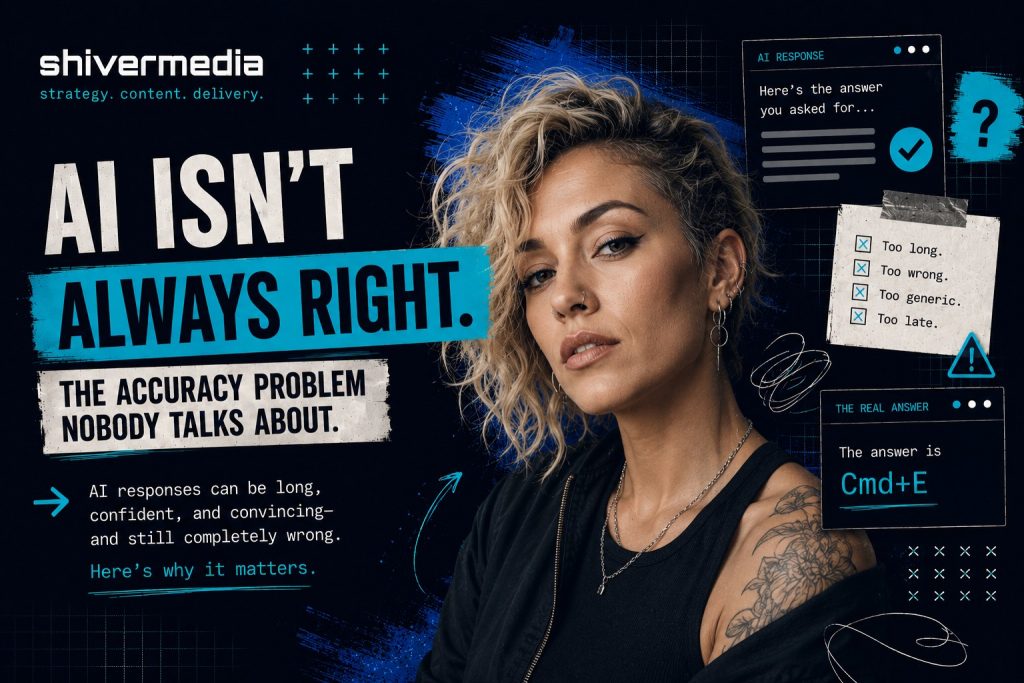
Ask a language model to summarize a document and it will often begin by explaining what it’s about to do. Ask it to rewrite a paragraph and it will frequently restate your original paragraph before showing the revision. Ask it a direct question and it will tell you what a great question it is, provide lengthy context, present multiple perspectives you didn’t ask for, and then answer the question at the end as though it were an afterthought.
This verbosity isn’t random. It’s built into how these systems are trained and evaluated. Longer, more thorough responses have historically scored better in human evaluations, not because they’re more useful, but because they appear more considered. The result is a tool that has learned to perform helpfulness rather than simply be helpful.
In practice, this means a significant portion of your time with AI tools goes toward skimming, filtering, and discarding. You read four paragraphs to extract one sentence. You scroll past context you already provided to find the answer buried underneath it. You re-read your own question reflected back at you before getting to the part that actually matters.
When you’re doing this dozens of times a day across dozens of tasks, the minutes add up fast.
When AI Gets Simple Things Wrong
The verbosity problem is annoying. The accuracy problem is expensive.
AI tools routinely produce instructions that are confidently written and completely wrong. Not vague. Wrong. Specific menu paths that don’t exist. Navigation steps that worked in a previous version of the software. Features that were announced but never released. Workflows that describe a process so close to the real one that you follow it for three steps before realizing you’re lost.
Here’s a practical example. Ask an AI tool how to apply a LUT in DaVinci Resolve and there’s a reasonable chance the steps it gives you will reference menus that have moved, options that were renamed, or workflows that were reorganized in a recent update. The instructions look correct. They’re plausible. They use the right language. But if you’re working in a different version than the model was trained on, or if the interface changed recently, you can follow the steps precisely and still end up nowhere.
The same problem shows up across the board. Marketing platforms like HubSpot, Meta Ads Manager, and Klaviyo update their interfaces regularly. Website builders including WordPress, Squarespace, and Webflow restructure settings, rename panels, and reorganize navigation with major updates. Lightroom’s export workflow looks different depending on whether you’re using Classic or the cloud version, and AI often doesn’t know which one you’re using or which version is current.
This matters because users who don’t already know the answer have no way to judge whether the instructions are correct. They follow them. They get stuck. They troubleshoot. They go back to the AI, receive a revised set of instructions, follow those, and get stuck somewhere else. By the time they find a current YouTube tutorial from someone who actually recorded their screen using the latest version of the software, they’ve spent 40 minutes on a task that would have taken 10 if they’d gone straight to the tutorial in the first place.
The AI didn’t save time. It borrowed time from later in the day and charged interest.
Why Everything Online Is Starting to Look the Same
Set the accuracy and verbosity problems aside for a moment. There’s a third issue that’s harder to measure but potentially more damaging over the long term: content produced with AI tools is converging.
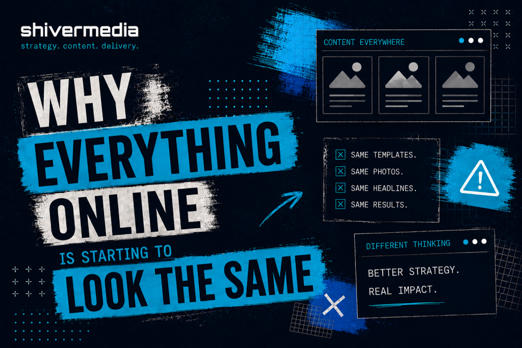
Walk through LinkedIn on any given day. The posts have a particular texture. They open with a short, punchy line, often a counterintuitive claim. They continue with a brief personal story. They pivot to a lesson. They close with a call to reflection. Some variation of “I used to think X. Then Y happened. Here’s what I learned.” The format has become so common it’s now a running joke among people who spend time on the platform. Yet it keeps spreading because it drives engagement, AI tools keep producing it, more people keep posting it, and the cycle continues.
The same convergence is happening in blog content. A structure has emerged, and it’s almost algorithmic. Open with a question or a surprising statistic. Define the problem. Break the solution into numbered sections with subheadings. Close with a summary and a call to action. There’s nothing inherently wrong with that approach, but when every article in a category follows the same architecture, readers stop reading and start scanning for the part that doesn’t sound like the last six articles they read on the same subject.
Website copy has its own version of this. The pattern usually looks something like this: a bold headline making a promise, a short subheadline adding specificity, a three-column feature section with icons, a social proof block, and a final call to action. The language inside those sections has converged as well. Words like “seamless,” “powerful,” “streamlined,” “built for teams,” and “everything you need” have been used so heavily across so much website copy that they’ve largely stopped meaning anything at all.
Email marketing, ad creative, YouTube thumbnails, AI-generated brand identities. They’re all following the same gravitational pull toward the statistical centre. The dramatic close-up. The bold yellow text on a dark background. The clean sans serif wordmark with generous spacing and a muted colour palette. The “here’s the truth nobody’s telling you” subject line.
None of this happened because marketers or creators stopped caring about originality. It happened because they’re all using tools trained on much of the same internet, learning from the same patterns, and producing outputs that reflect the same statistical consensus about what effective content looks like.
The Great Content Convergence
The technical reason for this convergence isn’t especially complicated, although it rarely makes its way into discussions about AI.
Large language models generate text by predicting the most statistically likely next token based on everything that came before it. They were trained on an enormous portion of publicly available written material including blog posts, articles, forums, documentation, marketing copy, books, and social media. They learn patterns in language, not meaning in the human sense.
When you ask a model to write a LinkedIn post about leadership, it doesn’t consider what might be an original perspective on leadership. It generates the sequence of words that most closely matches how leadership posts appeared across its training data. The result is something that resembles the average LinkedIn post on the subject, because statistically, that is the safest prediction.
Image generation models work in much the same way. They learn relationships between prompts and visual features across vast image datasets. Ask for a professional headshot or a modern brand logo and you’re likely to receive the visual consensus, the statistical centre of what those prompts most often represent. It looks convincing, but often lacks the distinctiveness that comes from intentional creative direction.
Reinforcement learning from human feedback, commonly referred to as RLHF, adds another layer. It is the process used to fine-tune most major language models after their initial training. The model is shaped by what human reviewers judge to be better responses. Those reviewers evaluate qualities such as helpfulness, clarity, and accuracy, but they also, inevitably, reward familiarity. Responses that sound right, match established patterns, and feel appropriately thorough are more likely to receive favourable ratings. Over time, the model learns to optimize for approval, and approval often correlates more closely with sounding like good content than being genuinely good content.
The result is a narrowing of the creative range. Not to zero. These tools can still surprise you, and they are capable of producing genuinely useful raw material. But the gravitational pull is always toward the centre. The expected structure. The familiar phrase. The statistical average.
The Hidden Cost of AI Friction
When people calculate the ROI of AI tools, they usually count the obvious wins. Time saved drafting emails. Research that once took an afternoon now taking 20 minutes. First drafts appearing in seconds instead of hours.
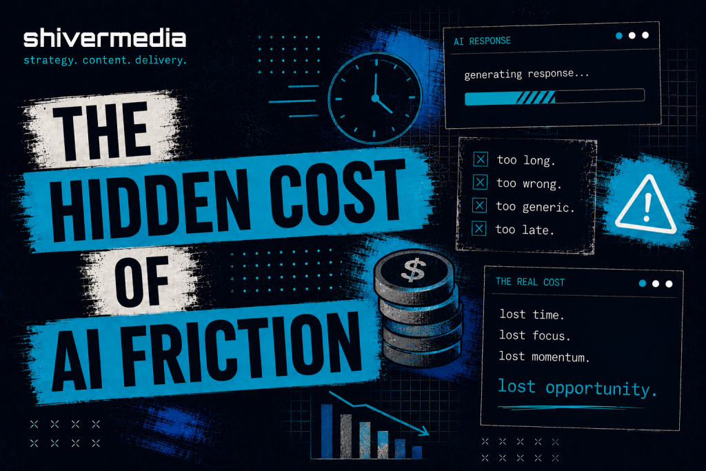
They rarely count the costs on the other side of the ledger.
Lost time from incorrect instructions is one of them. It is the kind of time debt described earlier, where following bad guidance takes longer to recover from than solving the problem independently would have. Verification overhead is another. Experienced users often check AI outputs against primary sources before trusting them, adding another step to almost every task. Then there is the editing burden: taking a verbose, highly structured, slightly generic draft and reshaping it into something with a distinctive voice. In many cases, that takes more effort than writing it from scratch.
Decision fatigue is another cost that rarely gets mentioned. When AI presents five slightly different versions of the same paragraph and asks you to choose, generates ten brand names that all feel interchangeable, or produces three email subject lines that are functionally identical, it has created work disguised as assistance. The cognitive load of evaluating output is real, and when you repeat that process throughout the day, it compounds.
There is also what could be called creative dilution. It is the gradual erosion of a distinctive voice as AI-generated language starts filling the gaps in someone’s work. A phrase that feels slightly off brand but close enough. A paragraph structure that functions well but does not quite sound like you. Individually, these compromises seem insignificant. Collectively, they reshape the work. Six months later the brand sounds different. Not dramatically different. Just a little blander. A little more like everyone else.
None of these costs appear in productivity case studies. They do not show up in benchmark comparisons between models. They remain largely invisible until you start looking for them, and by then many people are already paying the price.
How to Get Better Results
If you are going to use these tools, and there are good reasons to do so, the single most effective change you can make is to treat AI as a collaborator with clearly defined, constrained tasks rather than as an authority with an open-ended licence.
Most of the problems described in this article become worse when prompts are vague. “Write me a blog post about content marketing” invites a generic, highly structured, statistically average blog post about content marketing. The output will usually be technically competent and largely forgettable, leaving you to spend more time revising than writing.
Specificity is the biggest lever you control. The more precisely you define the task, the output format, the constraints, and what you do not want, the more useful the result tends to be. “Write a 200-word opening paragraph for a post about content marketing for independent consultants. Skip the definition of content marketing. No numbered lists. First person. Direct tone. Assume the reader already has years of experience.” That prompt produces something fundamentally different. Not always better, but much closer to the right territory.
Ask for one thing at a time. AI tools generally become less reliable as the scope of a request expands. A prompt that combines four separate tasks usually produces four mediocre answers instead of one strong one.
Whenever the output includes procedural steps, software instructions, technical workflows, or anything you need to follow in sequence, verify it before you follow it. Check the official documentation. Compare it against the current interface. Although verification adds a step, it usually saves time overall because it prevents the far greater cost of recovering from incorrect instructions.
Develop your thinking before using the tool. Do not ask AI to generate your ideas. Use it to test them, challenge them, expand them, or translate them into another format once you already know what you want to say. These systems are generally at their best as refinement tools rather than idea generators.
And when you discover that managing the output is taking longer than doing the work yourself, stop. No productivity tool is productive simply because it exists.
The Precision Prompt Framework
After considerable trial and error, I settled on a structure that consistently produces stronger results while reducing the amount of filtering and editing required afterwards. It has six components.
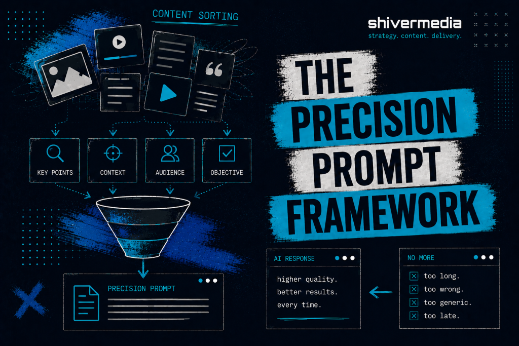
Objective. One sentence describing exactly what you need. Not background. Not context. The output itself. “Write a subject line for a re-engagement email targeting subscribers who have not opened an email in 60 days.”
Context. Only the information the model genuinely needs and cannot reasonably infer. Brand voice. Audience. External constraints. Keep it concise. The more context you provide, the more likely the model is to repeat it instead of using it.
Constraints. Explicit limits. Word count. Format restrictions. Things to avoid. “No questions. No emoji. Maximum eight words. Avoid urgency language such as ‘last chance’ or ‘don’t miss.’”
Output Format. Specify exactly how the response should be presented. “Give me five options in a numbered list with no commentary.” If you want one answer, say one. If you want three versions with different tones, say that instead.
Verification Requirements. For factual or procedural tasks, tell the model how to handle uncertainty. “If you are uncertain about any step, state that clearly rather than presenting it as confirmed.” It will not eliminate mistakes, but it greatly increases the chances that uncertainty is disclosed instead of hidden.
Response Rules. Tell the model what not to do. “Skip the introduction. Do not explain what a subject line is. No preamble. Start with option one.”
Here is what that difference looks like in practice.
Vague prompt: “Help me write a homepage for my design studio.”
Result: Four sections of generic copy covering services, philosophy, a placeholder testimonial, and a call to action. It is the kind of copy that could describe almost any design studio in almost any market.
Structured prompt: “Write homepage hero copy for a two-person brand design studio that works with food and hospitality businesses. The tone is warm without being casual, direct, and confident without sounding arrogant. Provide three versions consisting of a headline and one sentence of supporting copy. Avoid words such as ‘elevate,’ ‘transform,’ and ‘craft.’ Skip the explanation and go straight to the copy.”
Result: Three distinct starting points with an identifiable point of view instead of three cleaning projects.
The structured version takes about 90 seconds longer to write. It often saves 20 minutes of editing.
Recommendations for AI Developers
The problems described throughout this article are not unsolvable. Most are the result of design choices that could be made differently.
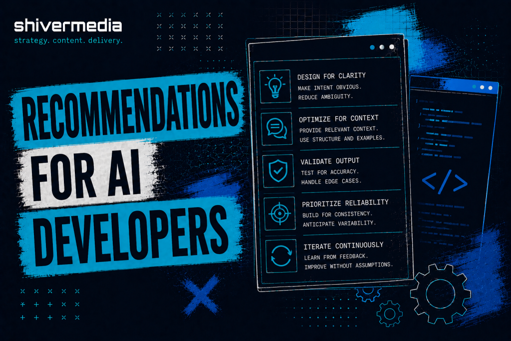
Adaptive verbosity would help enormously. A model that adjusts the length of its response to match the complexity of the request, instead of defaulting to the longest acceptable answer, would eliminate a significant amount of unnecessary filtering. A one-line question rarely needs a twelve-paragraph answer.
Better uncertainty reporting may be the single most valuable improvement available. The gap between how confident AI responses sound and how accurate they actually are remains the core trust issue. Models that identify uncertainty precisely where it exists, instead of hiding behind generic disclaimers, would allow users to verify selectively rather than feeling compelled to verify everything.
Context repetition could also be reduced. If the user has already provided information, repeating it before answering adds little value. Using that information instead of restating it would make interactions noticeably more efficient.
User preference memory, particularly for writing style, formatting, verbosity, and recurring constraints, would reduce the amount of prompt repetition required from experienced users. Repeating “no preamble, no lists, no summaries” in every conversation is friction that serves no useful purpose.
Finally, evaluation methods should place greater weight on usefulness than response length. That shift alone would move these systems closer to what many users actually need.
The Honest Conclusion
AI will not automatically make you more productive. It will not automatically improve your creative work. It will not automatically distinguish your business, your brand, or your content from the thousands of others using the same tools and the same prompts.
In many cases it produces more content, more words, and more noise. It produces work that sits near the statistical centre: recognizable, technically competent, and ultimately forgettable. It does this quickly, confidently, and at scale.
The people and organizations who benefit most from AI will not be the ones who use it the most. They will be the ones who understand what these systems are actually doing, verify before they trust, develop their own thinking before asking AI to refine it, and recognize when the tool is adding friction instead of removing it.
There is a way to use AI that genuinely saves time, improves output, and makes difficult work easier. Getting there requires treating these systems with the same critical judgement you would apply to any other source. Not because they are inherently untrustworthy, but because they are predictably imperfect in ways you can account for once you understand their limitations.
The shortcut that creates more work is not a shortcut. It is simply a longer route with better marketing.