Category: Digital Marketing

All posts realted to Digital Marketing and sub categories

  • If Everyone Uses AI, What Makes Your Work Different?

    If Everyone Uses AI, What Makes Your Work Different?

    The overlooked trade-off between productivity, originality, and trust.

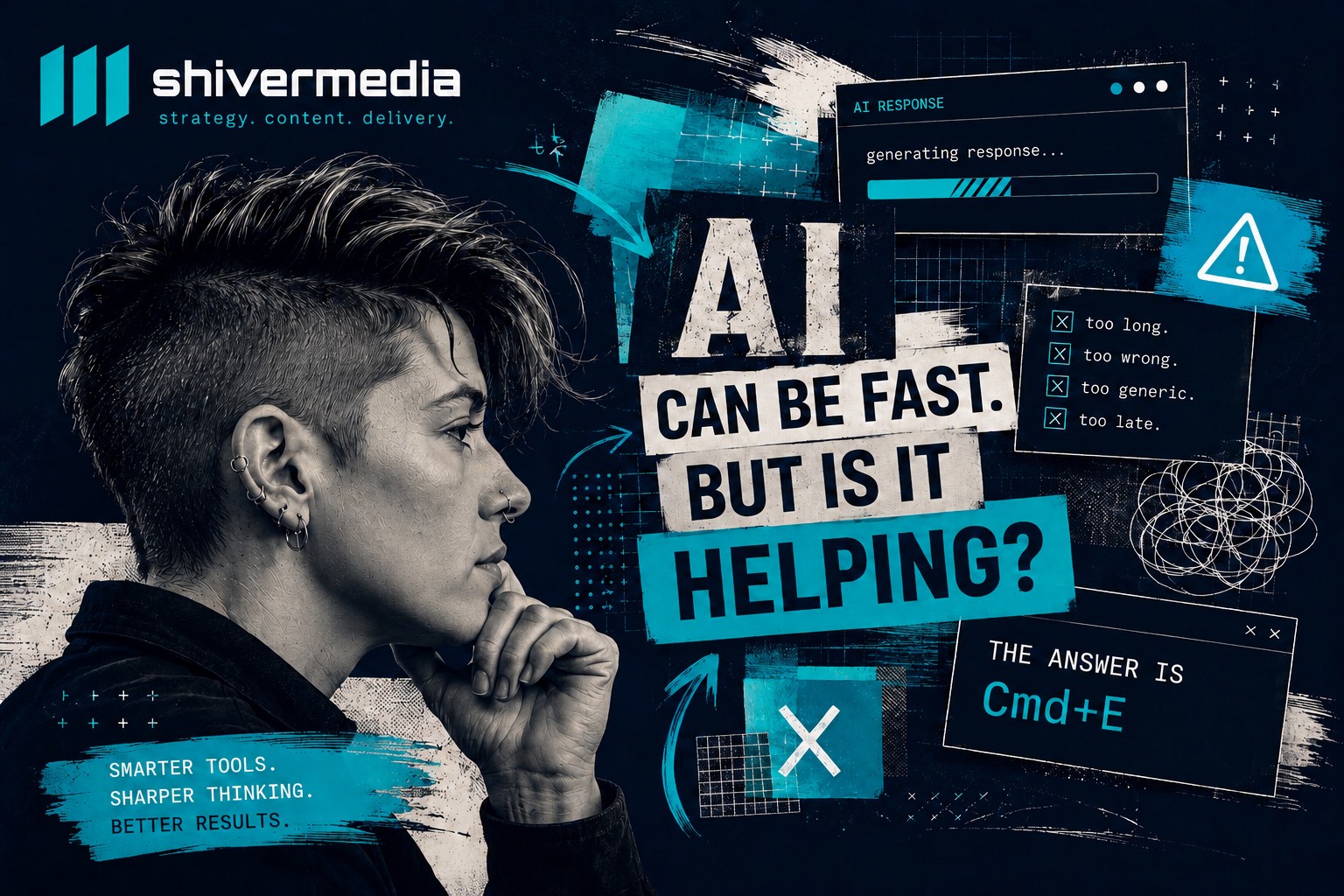
    You ask a simple question. Something like: “What’s the keyboard shortcut to merge layers in Photoshop?” Thirty seconds later you’re staring at four paragraphs explaining what layers are, a brief history of non-destructive editing, a note that the answer may vary by operating system, a reminder to save your work before merging, and then, finally, buried in the third paragraph, the actual answer. Cmd+E. Two characters. Done.

    This is not an edge case. It’s the default experience across most AI tools, most of the time.

    There’s a genuine irony in this. These tools are sold on productivity. They’re supposed to collapse hours of work into minutes. Sometimes they do. Just as often, though, they hand you a two-page document when you needed a sentence, give you instructions that don’t match the software you’re actually using, or produce content so generic it could have come from anyone, anywhere, writing about anything.

    AI can absolutely save time. It can accelerate research, sharpen a rough draft, stress-test an argument, and handle the mechanical parts of work that used to consume hours. Used well, it’s genuinely useful. But the conversation about what AI costs in time, trust, and creative originality is largely missing from the hype. This article is an attempt to have that conversation honestly.

    The Illusion of Productivity

    The most consistent problem with AI tools isn’t that they get things wrong. It’s that they create the feeling of progress while quietly adding friction at every step.
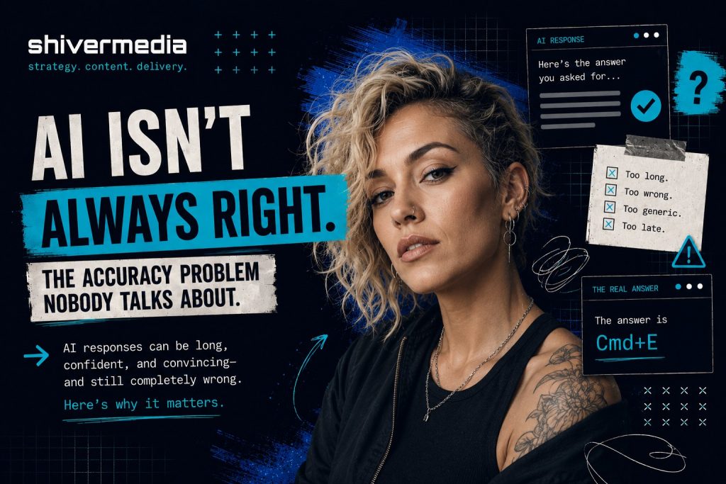
    Ask a language model to summarize a document and it will often begin by explaining what it’s about to do. Ask it to rewrite a paragraph and it will frequently restate your original paragraph before showing the revision. Ask it a direct question and it will tell you what a great question it is, provide lengthy context, present multiple perspectives you didn’t ask for, and then answer the question at the end as though it were an afterthought.

    This verbosity isn’t random. It’s built into how these systems are trained and evaluated. Longer, more thorough responses have historically scored better in human evaluations, not because they’re more useful, but because they appear more considered. The result is a tool that has learned to perform helpfulness rather than simply be helpful.

    In practice, this means a significant portion of your time with AI tools goes toward skimming, filtering, and discarding. You read four paragraphs to extract one sentence. You scroll past context you already provided to find the answer buried underneath it. You re-read your own question reflected back at you before getting to the part that actually matters.

    When you’re doing this dozens of times a day across dozens of tasks, the minutes add up fast.

    When AI Gets Simple Things Wrong

    The verbosity problem is annoying. The accuracy problem is expensive.

    AI tools routinely produce instructions that are confidently written and completely wrong. Not vague. Wrong. Specific menu paths that don’t exist. Navigation steps that worked in a previous version of the software. Features that were announced but never released. Workflows that describe a process so close to the real one that you follow it for three steps before realizing you’re lost.

    Here’s a practical example. Ask an AI tool how to apply a LUT in DaVinci Resolve and there’s a reasonable chance the steps it gives you will reference menus that have moved, options that were renamed, or workflows that were reorganized in a recent update. The instructions look correct. They’re plausible. They use the right language. But if you’re working in a different version than the model was trained on, or if the interface changed recently, you can follow the steps precisely and still end up nowhere.

    The same problem shows up across the board. Marketing platforms like HubSpot, Meta Ads Manager, and Klaviyo update their interfaces regularly. Website builders including WordPress, Squarespace, and Webflow restructure settings, rename panels, and reorganize navigation with major updates. Lightroom’s export workflow looks different depending on whether you’re using Classic or the cloud version, and AI often doesn’t know which one you’re using or which version is current.

    This matters because users who don’t already know the answer have no way to judge whether the instructions are correct. They follow them. They get stuck. They troubleshoot. They go back to the AI, receive a revised set of instructions, follow those, and get stuck somewhere else. By the time they find a current YouTube tutorial from someone who actually recorded their screen using the latest version of the software, they’ve spent 40 minutes on a task that would have taken 10 if they’d gone straight to the tutorial in the first place.

    The AI didn’t save time. It borrowed time from later in the day and charged interest.

    Why Everything Online Is Starting to Look the Same

    Set the accuracy and verbosity problems aside for a moment. There’s a third issue that’s harder to measure but potentially more damaging over the long term: content produced with AI tools is converging.
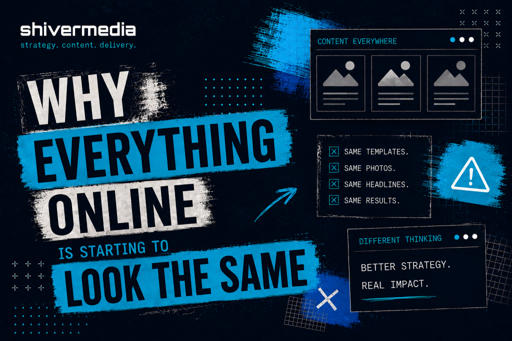
    everything looks the same with AI

    Walk through LinkedIn on any given day. The posts have a particular texture. They open with a short, punchy line, often a counterintuitive claim. They continue with a brief personal story. They pivot to a lesson. They close with a call to reflection. Some variation of “I used to think X. Then Y happened. Here’s what I learned.” The format has become so common it’s now a running joke among people who spend time on the platform. Yet it keeps spreading because it drives engagement, AI tools keep producing it, more people keep posting it, and the cycle continues.

    The same convergence is happening in blog content. A structure has emerged, and it’s almost algorithmic. Open with a question or a surprising statistic. Define the problem. Break the solution into numbered sections with subheadings. Close with a summary and a call to action. There’s nothing inherently wrong with that approach, but when every article in a category follows the same architecture, readers stop reading and start scanning for the part that doesn’t sound like the last six articles they read on the same subject.

    Website copy has its own version of this. The pattern usually looks something like this: a bold headline making a promise, a short subheadline adding specificity, a three-column feature section with icons, a social proof block, and a final call to action. The language inside those sections has converged as well. Words like “seamless,” “powerful,” “streamlined,” “built for teams,” and “everything you need” have been used so heavily across so much website copy that they’ve largely stopped meaning anything at all.

    Email marketing, ad creative, YouTube thumbnails, AI-generated brand identities. They’re all following the same gravitational pull toward the statistical centre. The dramatic close-up. The bold yellow text on a dark background. The clean sans serif wordmark with generous spacing and a muted colour palette. The “here’s the truth nobody’s telling you” subject line.

    None of this happened because marketers or creators stopped caring about originality. It happened because they’re all using tools trained on much of the same internet, learning from the same patterns, and producing outputs that reflect the same statistical consensus about what effective content looks like.

    The Great Content Convergence

    The technical reason for this convergence isn’t especially complicated, although it rarely makes its way into discussions about AI.

    Large language models generate text by predicting the most statistically likely next token based on everything that came before it. They were trained on an enormous portion of publicly available written material including blog posts, articles, forums, documentation, marketing copy, books, and social media. They learn patterns in language, not meaning in the human sense.

    When you ask a model to write a LinkedIn post about leadership, it doesn’t consider what might be an original perspective on leadership. It generates the sequence of words that most closely matches how leadership posts appeared across its training data. The result is something that resembles the average LinkedIn post on the subject, because statistically, that is the safest prediction.

    Image generation models work in much the same way. They learn relationships between prompts and visual features across vast image datasets. Ask for a professional headshot or a modern brand logo and you’re likely to receive the visual consensus, the statistical centre of what those prompts most often represent. It looks convincing, but often lacks the distinctiveness that comes from intentional creative direction.

    Reinforcement learning from human feedback, commonly referred to as RLHF, adds another layer. It is the process used to fine-tune most major language models after their initial training. The model is shaped by what human reviewers judge to be better responses. Those reviewers evaluate qualities such as helpfulness, clarity, and accuracy, but they also, inevitably, reward familiarity. Responses that sound right, match established patterns, and feel appropriately thorough are more likely to receive favourable ratings. Over time, the model learns to optimize for approval, and approval often correlates more closely with sounding like good content than being genuinely good content.

    The result is a narrowing of the creative range. Not to zero. These tools can still surprise you, and they are capable of producing genuinely useful raw material. But the gravitational pull is always toward the centre. The expected structure. The familiar phrase. The statistical average.

    The Hidden Cost of AI Friction

    When people calculate the ROI of AI tools, they usually count the obvious wins. Time saved drafting emails. Research that once took an afternoon now taking 20 minutes. First drafts appearing in seconds instead of hours.
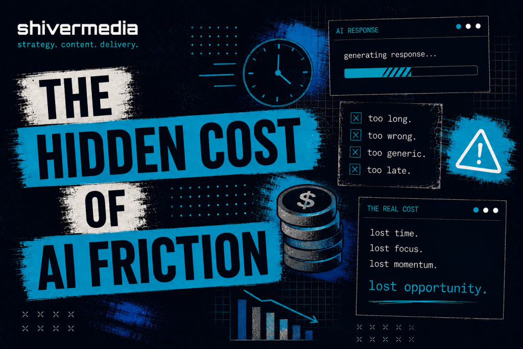
    They rarely count the costs on the other side of the ledger.

    Lost time from incorrect instructions is one of them. It is the kind of time debt described earlier, where following bad guidance takes longer to recover from than solving the problem independently would have. Verification overhead is another. Experienced users often check AI outputs against primary sources before trusting them, adding another step to almost every task. Then there is the editing burden: taking a verbose, highly structured, slightly generic draft and reshaping it into something with a distinctive voice. In many cases, that takes more effort than writing it from scratch.

    Decision fatigue is another cost that rarely gets mentioned. When AI presents five slightly different versions of the same paragraph and asks you to choose, generates ten brand names that all feel interchangeable, or produces three email subject lines that are functionally identical, it has created work disguised as assistance. The cognitive load of evaluating output is real, and when you repeat that process throughout the day, it compounds.

    There is also what could be called creative dilution. It is the gradual erosion of a distinctive voice as AI-generated language starts filling the gaps in someone’s work. A phrase that feels slightly off brand but close enough. A paragraph structure that functions well but does not quite sound like you. Individually, these compromises seem insignificant. Collectively, they reshape the work. Six months later the brand sounds different. Not dramatically different. Just a little blander. A little more like everyone else.

    None of these costs appear in productivity case studies. They do not show up in benchmark comparisons between models. They remain largely invisible until you start looking for them, and by then many people are already paying the price.

    How to Get Better Results

    If you are going to use these tools, and there are good reasons to do so, the single most effective change you can make is to treat AI as a collaborator with clearly defined, constrained tasks rather than as an authority with an open-ended licence.

    Most of the problems described in this article become worse when prompts are vague. “Write me a blog post about content marketing” invites a generic, highly structured, statistically average blog post about content marketing. The output will usually be technically competent and largely forgettable, leaving you to spend more time revising than writing.

    Specificity is the biggest lever you control. The more precisely you define the task, the output format, the constraints, and what you do not want, the more useful the result tends to be. “Write a 200-word opening paragraph for a post about content marketing for independent consultants. Skip the definition of content marketing. No numbered lists. First person. Direct tone. Assume the reader already has years of experience.” That prompt produces something fundamentally different. Not always better, but much closer to the right territory.

    Ask for one thing at a time. AI tools generally become less reliable as the scope of a request expands. A prompt that combines four separate tasks usually produces four mediocre answers instead of one strong one.

    Whenever the output includes procedural steps, software instructions, technical workflows, or anything you need to follow in sequence, verify it before you follow it. Check the official documentation. Compare it against the current interface. Although verification adds a step, it usually saves time overall because it prevents the far greater cost of recovering from incorrect instructions.

    Develop your thinking before using the tool. Do not ask AI to generate your ideas. Use it to test them, challenge them, expand them, or translate them into another format once you already know what you want to say. These systems are generally at their best as refinement tools rather than idea generators.

    And when you discover that managing the output is taking longer than doing the work yourself, stop. No productivity tool is productive simply because it exists.

    The Precision Prompt Framework

    After considerable trial and error, I settled on a structure that consistently produces stronger results while reducing the amount of filtering and editing required afterwards. It has six components.
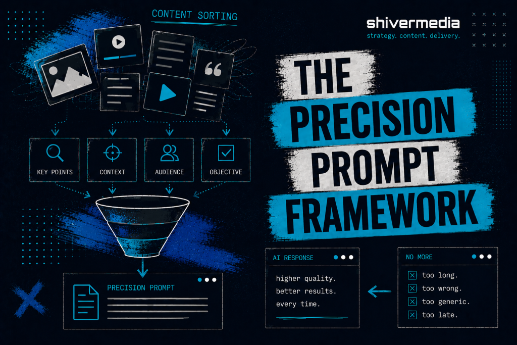
    Objective. One sentence describing exactly what you need. Not background. Not context. The output itself. “Write a subject line for a re-engagement email targeting subscribers who have not opened an email in 60 days.”

    Context. Only the information the model genuinely needs and cannot reasonably infer. Brand voice. Audience. External constraints. Keep it concise. The more context you provide, the more likely the model is to repeat it instead of using it.

    Constraints. Explicit limits. Word count. Format restrictions. Things to avoid. “No questions. No emoji. Maximum eight words. Avoid urgency language such as ‘last chance’ or ‘don’t miss.’”

    Output Format. Specify exactly how the response should be presented. “Give me five options in a numbered list with no commentary.” If you want one answer, say one. If you want three versions with different tones, say that instead.

    Verification Requirements. For factual or procedural tasks, tell the model how to handle uncertainty. “If you are uncertain about any step, state that clearly rather than presenting it as confirmed.” It will not eliminate mistakes, but it greatly increases the chances that uncertainty is disclosed instead of hidden.

    Response Rules. Tell the model what not to do. “Skip the introduction. Do not explain what a subject line is. No preamble. Start with option one.”

    Here is what that difference looks like in practice.

    Vague prompt: “Help me write a homepage for my design studio.”

    Result: Four sections of generic copy covering services, philosophy, a placeholder testimonial, and a call to action. It is the kind of copy that could describe almost any design studio in almost any market.

    Structured prompt: “Write homepage hero copy for a two-person brand design studio that works with food and hospitality businesses. The tone is warm without being casual, direct, and confident without sounding arrogant. Provide three versions consisting of a headline and one sentence of supporting copy. Avoid words such as ‘elevate,’ ‘transform,’ and ‘craft.’ Skip the explanation and go straight to the copy.”

    Result: Three distinct starting points with an identifiable point of view instead of three cleaning projects.

    The structured version takes about 90 seconds longer to write. It often saves 20 minutes of editing.

    Recommendations for AI Developers

    The problems described throughout this article are not unsolvable. Most are the result of design choices that could be made differently.
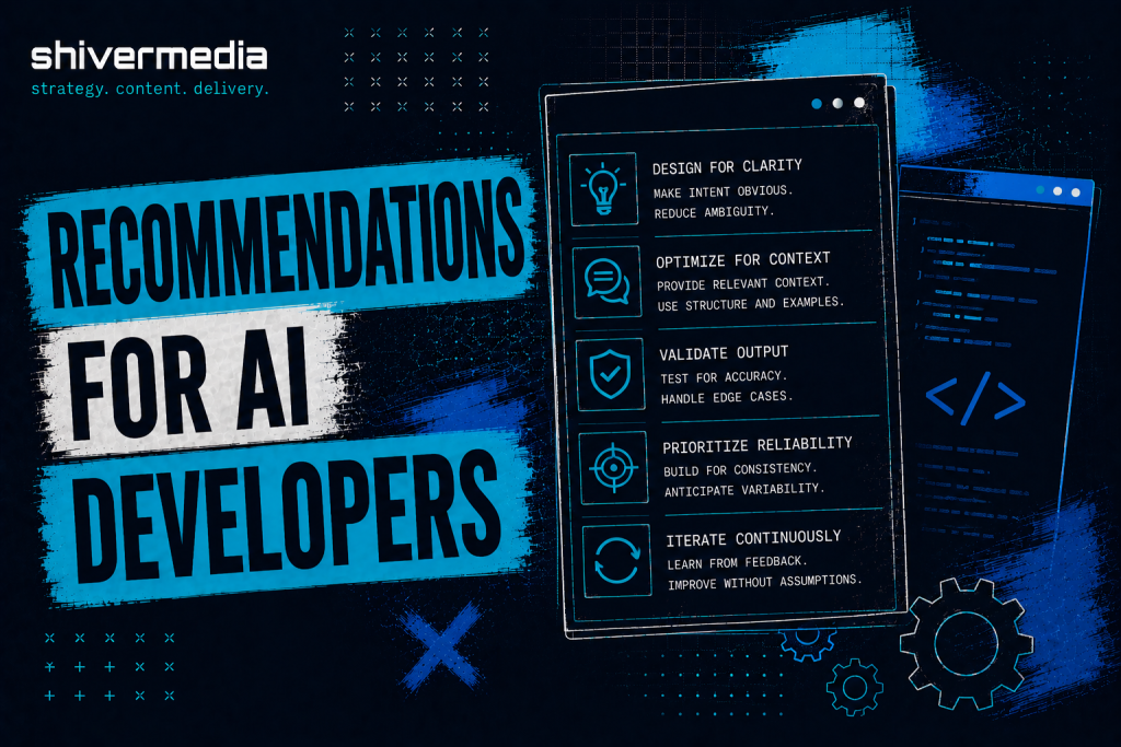
    Adaptive verbosity would help enormously. A model that adjusts the length of its response to match the complexity of the request, instead of defaulting to the longest acceptable answer, would eliminate a significant amount of unnecessary filtering. A one-line question rarely needs a twelve-paragraph answer.

    Better uncertainty reporting may be the single most valuable improvement available. The gap between how confident AI responses sound and how accurate they actually are remains the core trust issue. Models that identify uncertainty precisely where it exists, instead of hiding behind generic disclaimers, would allow users to verify selectively rather than feeling compelled to verify everything.

    Context repetition could also be reduced. If the user has already provided information, repeating it before answering adds little value. Using that information instead of restating it would make interactions noticeably more efficient.

    User preference memory, particularly for writing style, formatting, verbosity, and recurring constraints, would reduce the amount of prompt repetition required from experienced users. Repeating “no preamble, no lists, no summaries” in every conversation is friction that serves no useful purpose.

    Finally, evaluation methods should place greater weight on usefulness than response length. That shift alone would move these systems closer to what many users actually need.

    The Honest Conclusion

    AI will not automatically make you more productive. It will not automatically improve your creative work. It will not automatically distinguish your business, your brand, or your content from the thousands of others using the same tools and the same prompts.

    In many cases it produces more content, more words, and more noise. It produces work that sits near the statistical centre: recognizable, technically competent, and ultimately forgettable. It does this quickly, confidently, and at scale.

    The people and organizations who benefit most from AI will not be the ones who use it the most. They will be the ones who understand what these systems are actually doing, verify before they trust, develop their own thinking before asking AI to refine it, and recognize when the tool is adding friction instead of removing it.

    There is a way to use AI that genuinely saves time, improves output, and makes difficult work easier. Getting there requires treating these systems with the same critical judgement you would apply to any other source. Not because they are inherently untrustworthy, but because they are predictably imperfect in ways you can account for once you understand their limitations.

    The shortcut that creates more work is not a shortcut. It is simply a longer route with better marketing.
  • Building Email Flows That Actually Work

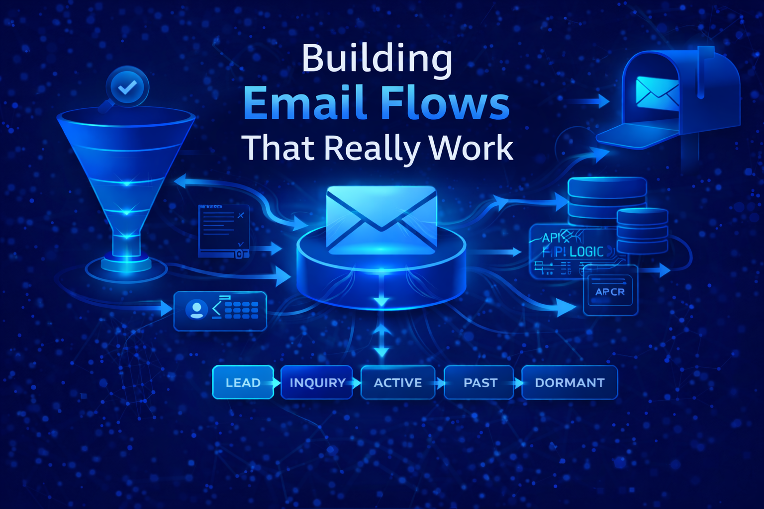
    Building Email Flows That Actually Work

    From Welcome to Conditional Logic, API Triggers, and Lifecycle Intelligence

    Email marketing doesn’t fail because email is outdated.

    It fails because most businesses never build the system behind it.

    What most people call “email marketing” is a handful of disconnected campaigns, sent manually, with no shared logic, no usable data, and no real understanding of where a subscriber actually sits in the relationship.

    A proper email flow isn’t a sequence.

    It’s a decision system.

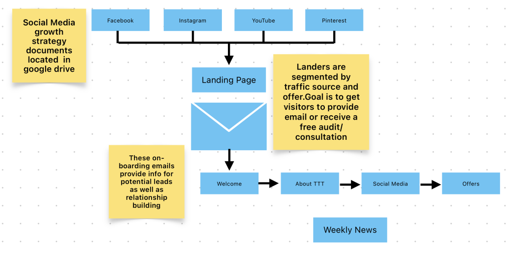
    This article walks through how I build email flows for clients, starting with onboarding and welcome flows, moving through conditional “if / then” logic, API-driven list population, and lifecycle movement over time. This is the same thinking used when designing systems for clients like MuchoShare, Turquoise Tides Travel, and other service- and booking-driven businesses.

    This isn’t about prettier emails.

    It’s about infrastructure that supports the business instead of fighting it.


    Start With the Map, Not the Messages

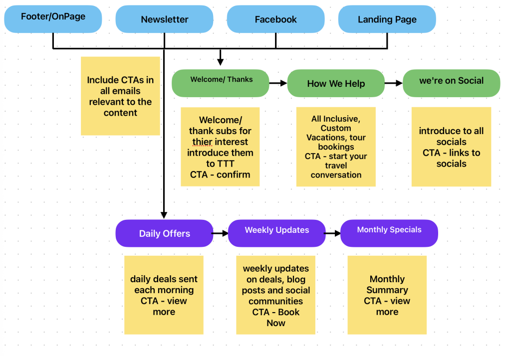
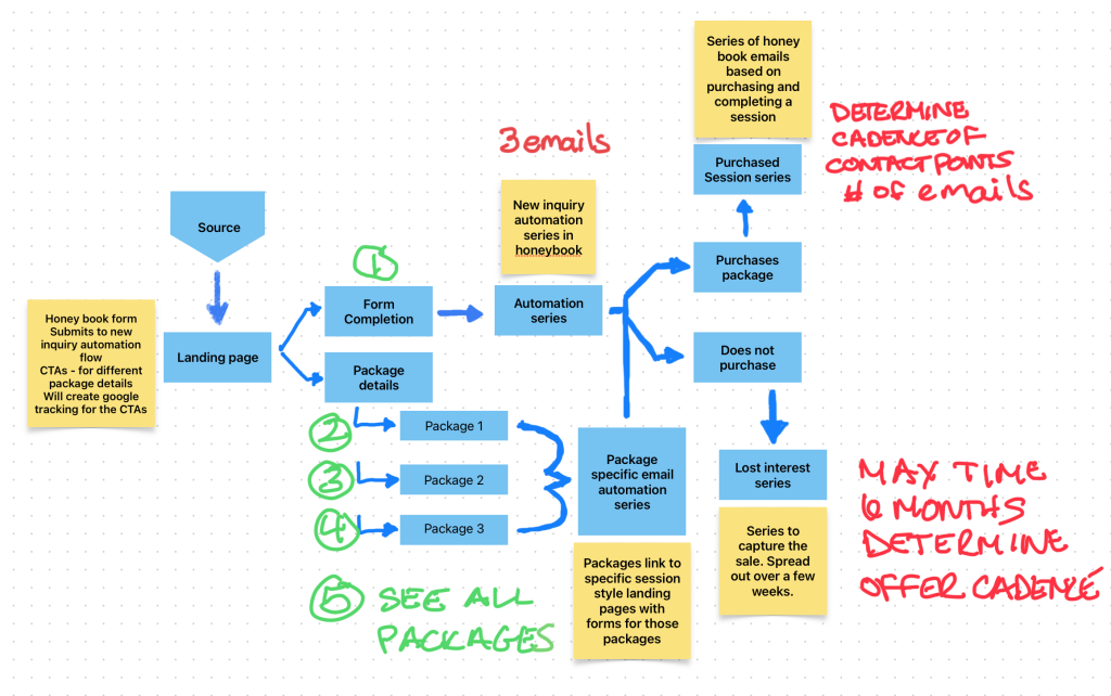
    Before a single email gets written, the first deliverable is always a flow chart.

    Not copy.

    Not subject lines.

    A map.

    Flow charts force clarity. They expose gaps early. They stop assumptions from becoming systems.

    At a minimum, an email flow map should answer:

    • How does someone enter the system?
    • What data is captured at entry?
    • What conditions change their path?
    • What actions do those conditions trigger?
    • Where does the system hand off to people, platforms, or other tools?

    If you can’t answer those visually, the system isn’t ready to be built.

    This is where most businesses rush. They want “the welcome emails” first. That’s backwards. The welcome flow is a result of decisions made upstream.


    The Welcome Flow Is a Gate, Not a Greeting

    Most welcome flows are treated like brand introductions.

    They shouldn’t be.

    A welcome flow is a sorting mechanism.

    Its job is to:

    • Confirm intent
    • Capture context
    • Apply tags or custom fields
    • Route the subscriber into the correct lifecycle path

    A direct booking guest, a newsletter signup, a referral, and a repeat customer are not the same person. Treating them as such is where systems break.

    What the Welcome Flow Actually Does

    At the infrastructure level, a welcome flow should:

    • Assign source data
    • Apply role or intent tags
    • Populate custom fields (dates, preferences, product interest)
    • Trigger downstream logic automatically

    The emails themselves can be simple.

    The system behind them can’t be.

    If / Then Logic: Where Email Becomes a System

    This is where email stops being marketing and starts being operations.

    “If / then” logic allows the platform to make decisions without human intervention.

    Examples:

    • If a booking is completed Then move the contact to “Active Guest” and suppress promotions
    • If a quote is sent but not confirmed within X days Then trigger a reminder sequence
    • If a user clicks a specific link Then update interest data and reroute future messaging
    • If a cancellation occurs Then notify internal teams and adjust lifecycle status

    This logic should never live only in someone’s head.

    It belongs in the flow chart.

    Every conditional path reduces friction and prevents irrelevant messaging.

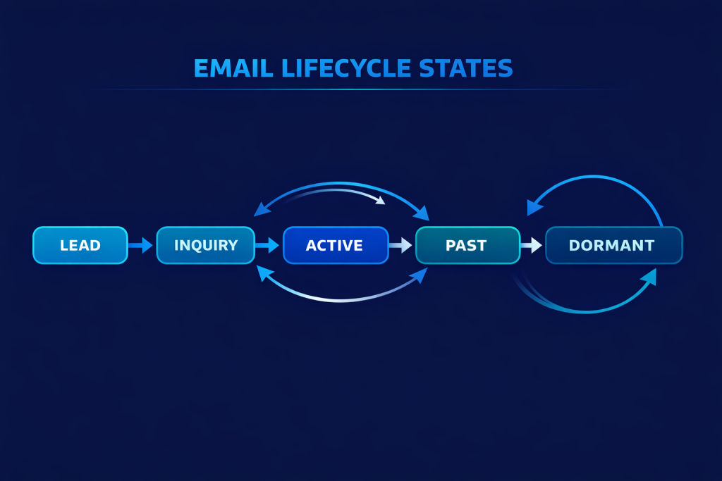
    Email Lists Are Not Buckets. They Are States.

    One of the most common mistakes I see is list misuse.

    Lists should represent states, not audiences.

    A state answers one question:

    Where is this person right now in their relationship with the business?

    Examples:

    • New Lead
    • Warm Inquiry
    • Active Booking
    • Past Guest
    • Dormant
    • Owner or Partner
    • Internal Notifications Only

    When lists are treated this way, movement between them becomes meaningful. Contacts move through lists instead of piling up inside them.

    This matters for automation, reporting, and deliverability.


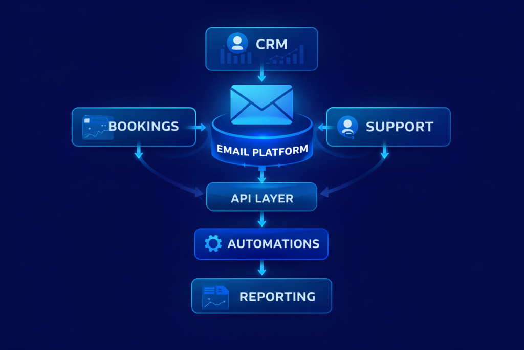
    Why API Triggers Matter

    Manual list management doesn’t scale.

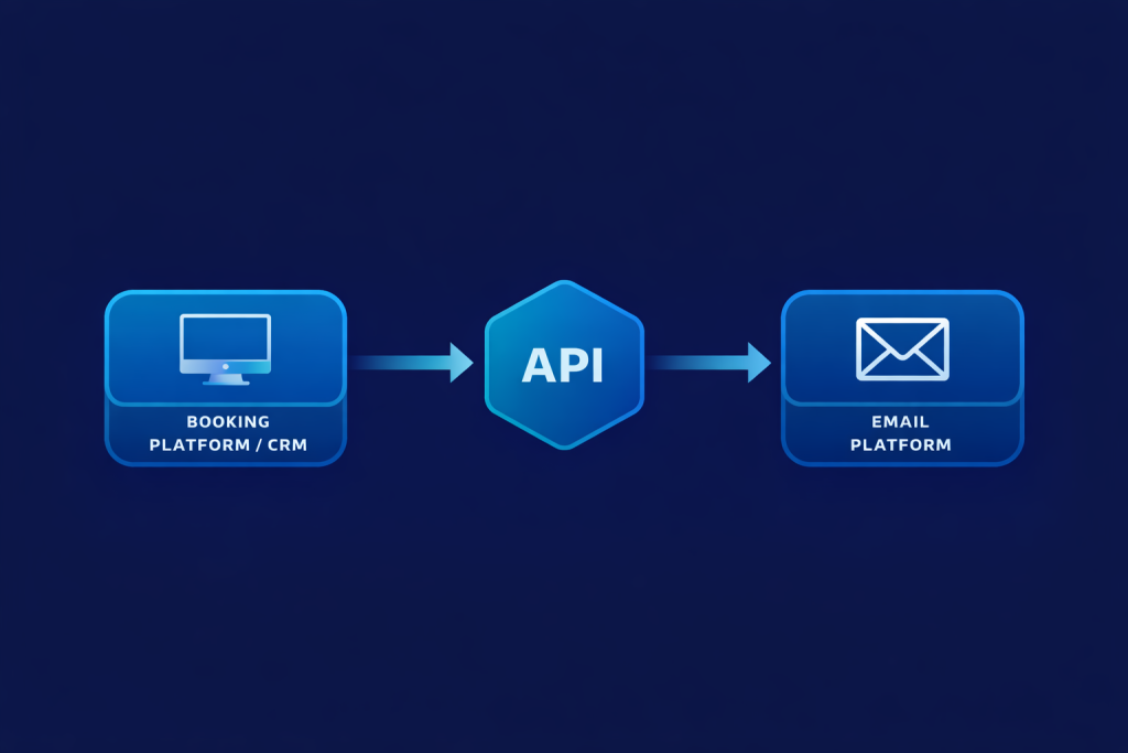
    API triggers are what turn email into infrastructure.

    An API allows external systems to:

    • Add or update subscribers automatically
    • Pass structured data
    • Trigger automations in real time
    • Change lifecycle states without human input

    This is essential when email needs to react to bookings, purchases, cancellations, or updates happening outside the email platform.

    What Data Should Be Passed via API

    At minimum:

    • Email address
    • Name (when available)
    • Lifecycle state
    • Source or trigger event
    • Relevant dates
    • Transaction or booking IDs

    This data should populate custom fields, not just tags.

    Tags are flags.

    Fields are memory.


    Keeping Lists Updated Without Manual Cleanup

    A properly built system doesn’t require weekly list maintenance.

    Movement happens automatically based on events.

    Examples:

    • Booking confirmed → removed from Inquiry
    • Stay completed → moved to Past Guest
    • Rebooked → moved back to Active
    • Long-term inactivity → moved to Dormant

    If someone has to remember to “move people around,” the system is already failing.


    Planned Structure Improves Deliverability

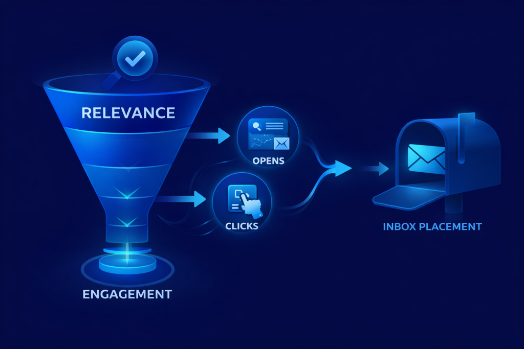
    Deliverability isn’t just DNS records and authentication.

    It’s relevance.

    Inbox providers track engagement signals constantly. When subscribers receive emails that don’t match their current state, engagement drops. When engagement drops, inbox placement follows.

    Planned structure ensures:

    • Fewer unnecessary sends
    • Higher relevance
    • Clean suppression rules
    • More predictable performance

    This protects the list long-term.


    Planning Before Building Saves Money

    Clients often want to “start sending” quickly.

    What they don’t see is that rebuilding later costs more.

    Planning upfront:

    • Reduces rework
    • Prevents logic conflicts
    • Speeds onboarding
    • Simplifies reporting
    • Makes future integrations possible without rebuilds

    A flow chart might take hours or days.

    Fixing a broken system takes weeks

    Flow Charts Are Living Documents

    A flow chart isn’t a one-time artifact.

    It should be:

    • Updated when systems change
    • Referenced when campaigns are added
    • Used during onboarding
    • Treated as operational documentation

    When email supports operations, the flow chart becomes a shared reference point across teams.


    Where Most Email Systems Break Down

    The failure points are consistent:

    • No lifecycle clarity
    • Lists used as dumping grounds
    • No suppression logic
    • Manual updates
    • Copy written before structure
    • No integration with booking or CRM systems

    These aren’t copy problems.

    They’re planning problems.


    Email as a Business Asset

    When built correctly, an email system becomes:

    • A communication backbone
    • A data layer
    • A customer memory
    • A conversion engine
    • A retention tool

    It’s not dependent on algorithms.

    It’s not rented attention.

    It’s owned infrastructure.

    That’s why email still outperforms social for lifecycle communication.


    Final Thought

    Email flows aren’t about sending more emails.

    They’re about sending the right email, at the right time, based on real data, without manual effort.

    That only happens when:

    • The system is mapped first
    • Logic is documented
    • Lists represent states
    • APIs handle movement
    • Email is treated as infrastructure, not campaigns

    Everything else is noise.

    More References for Email Marketing
    HubSpot, SparkPost, Litnus

  • Email Marketing is Still King

    Email Marketing is Still King

    Why Email Marketing Is Still the King of Conversions Heading into 2026

    Every couple of years, someone comes along to declare email is dead. The headlines pop up like clockwork: “Email is Over,” “No One Reads Emails Anymore,” or “Social Media Has Replaced Email.”

    But here we are, stepping into 2026, and email is still the number one conversion tool in digital marketing. In fact, it’s stronger than ever.

    The truth is, email isn’t going anywhere. People may scroll past ads, algorithms may hide your posts, SEO may take months to gain traction — but email lands directly in the inbox. It’s personal, measurable, and built to drive action. For businesses serious about generating leads and conversions, email remains the backbone of a strong digital strategy.

    At ShiverMedia, we’ve been in the email game for over 20 years. We’ve run campaigns for dating apps, fitness brands, travel companies, and entertainment projects. We’ve seen the shift from basic text newsletters to hyper-personalized, AI-powered, data-driven campaigns. And after two decades, we can say this with confidence: email is not dead — it’s the best tool you have for conversions in 2026.

    email is always king

    Why People Still Think Email Is Dead

    So why do people keep writing obituaries for email marketing?

    1. Shiny New Toys Every new platform — from TikTok to Threads to whatever comes next — creates the illusion that older channels are irrelevant. But trends come and go. Email stays.
    2. Overcrowded Inboxes Yes, people get a lot of email. But they still read the ones that matter. The average professional checks their email around 15 times a day.
    3. Poor Campaigns Marketers who blast irrelevant, spammy content see weak results and assume email doesn’t work. The truth is, bad email doesn’t work. Good email still crushes it.
    4. Spam Confusion Many people confuse spam with real marketing. Spam is junk. Real email marketing is permission-based, relevant, and adds value.

    When you look at the actual numbers, email tells a different story. The industry average ROI continues to sit around $36 for every $1 spent. Social media ad costs are rising, SEO takes months to generate returns, but email delivers results you can measure instantly.


    True Email vs. Spam: The Big Difference

    It’s worth underlining this point: true email marketing is not spam.

    • True Email Marketing is personalized, relevant, and permission-based. People opt in because they want your content. The emails are tailored to their interests, behaviors, or past purchases. They respect boundaries and create trust.
    • Spam is generic, intrusive, and often sent without consent. It’s the digital equivalent of junk mail. It doesn’t care who’s on the other end.

    We’ve seen this difference play out in real campaigns.

    For a dating app client, instead of blasting the same message to everyone, we created behavior-based triggers. If someone hadn’t logged in for two weeks, they got a gentle nudge. If someone had just joined, they got a welcome sequence guiding them through features. The results? Engagement rates soared. Spam doesn’t do that. Real email marketing does.


    Why Email Outperforms Social and SEO

    Social media and SEO have their place, but when it comes to conversions, email leaves them behind.

    Direct Access

    On social, algorithms decide who sees your content. On search, you’re fighting for visibility against millions of results. Email goes straight to the inbox. If they opted in, you’re in.

    Built for Action

    People scroll social feeds for entertainment. They use Google to research. But when they open their inbox, they’re primed for action. Email is designed for CTAs — click, buy, register, download.

    ROI That Beats Everything Else

    $36 for every $1 spent. No other channel consistently comes close.

    Data You Can Use

    Email marketing provides granular insights: open rates, click-throughs, conversions, even heat maps showing what parts of your message get attention. Social and SEO can’t compete with that level of clarity.

    Ownership

    You don’t own your social followers. The platform does. Your SEO rankings can vanish with the next Google update. Your email list? That’s yours. It’s an asset no one can take away.


    ESPs Powering Email Marketing in 2026

    The tools available today are smarter and more powerful than ever. They’re no longer just about sending newsletters. They’re about creating automated, personalized, AI-driven experiences. Here’s a look at the ESPs shaping 2026:

    MailerLite

    Affordable, intuitive, and powerful. MailerLite has become a go-to for small businesses, creators, and startups. It offers easy drag-and-drop design, strong automation, and solid deliverability at a fraction of the cost of some bigger platforms. For businesses just starting out — or those who want clean, no-frills power — MailerLite is a serious contender.

    Klaviyo

    The gold standard for e-commerce. Its predictive analytics and Shopify integration make it a powerhouse for online stores. Perfect if you need to send abandoned cart reminders, product recommendations, or seasonal promos.

    Mailchimp

    Still a major player, especially for small to midsize businesses. Easy-to-use templates, AI-assisted tools, and solid automation workflows.

    HubSpot

    For businesses that need CRM + email in one ecosystem, HubSpot delivers. Its ability to tie marketing, sales, and service together makes it ideal for complex buyer journeys.

    ActiveCampaign

    Great for service-based businesses or B2B brands that need robust automation and CRM features. Excellent for long, relationship-driven funnels.

    Litmus & Stripo

    Design and testing tools that ensure your emails look good everywhere. With more users opening on mobile and dark mode, testing is critical.

    Phrasee & AI Tools

    AI tools like Phrasee are rewriting subject lines and optimizing content tone to boost engagement. As AI evolves, expect ESPs to roll these features directly into their platforms.


    How to Choose the Right ESP

    Not every ESP is a fit for every business. Ask yourself:

    • Can it scale with your list growth?
    • Does it support the workflows you need (abandoned cart, re-engagement, onboarding)?
    • Does it integrate with your e-commerce platform, CRM, or booking system?
    • Are analytics strong enough to prove ROI?
    • Does it support compliance (GDPR, CCPA, CASL)?

    At ShiverMedia, we’ve guided clients through these choices. For fitness brands, automation and scheduling are top priorities. For travel companies, segmentation rules the day. For startups, affordability and ease of use matter most. The “best” ESP is the one that supports your business model and growth stage.


    ShiverMedia’s 20-Year Email Journey

    We’ve been at this since the early 2000s, when email meant clunky HTML and mass newsletters. Back then, personalization meant adding “Hi [First Name].”

    Fast-forward 20 years, and the landscape is unrecognizable. Automation, segmentation, AI-driven content, and predictive analytics have changed the game.

    • Dating Apps: We built onboarding flows, re-engagement campaigns, and premium upsell funnels. These improved retention and boosted subscriptions.
    • Travel Companies: We segmented audiences into families, couples, and adventure travelers. Bookings rose by 30% in three months.
    • Fitness Brands: We automated reminders, motivational content, and upsell offers. Churn dropped, memberships grew.
    • Entertainment Projects: From event reminders to episodic promos, emails consistently drove ticket sales and engagement.

    The lesson? No matter the industry, email delivers when you respect the audience and build a strategy that serves them.


    Best Practices for Email in 2026

    1. Segmentation Is Essential

    Generic blasts don’t work. Group your audience by interest, behavior, or stage in the funnel.

    2. Smarter Automation

    From welcome series to re-engagement flows, automation saves time and nurtures leads around the clock.

    3. Mobile-First Design

    Over 60% of emails are opened on mobile. If it doesn’t look good on a phone, it doesn’t work.

    4. Privacy and Compliance

    With GDPR, CCPA, and likely new regulations ahead, compliance isn’t optional. Always get opt-in consent and make unsubscribing easy.

    5. Testing and Optimization

    Subject lines, send times, layouts — test everything. Even small improvements stack into major ROI.

    6. Value Over Volume

    Don’t send more emails. Send better ones. Each email should have a reason to exist and deliver value.


    Case Studies by Industry

    Travel

    A boutique travel company segmented customers by type of traveler. Families got different content than solo adventurers. The result? Open rates up 40%, conversions up 30%.

    Dating Apps

    Behavioral triggers sent nudges to inactive users, improving retention by 25%.

    Fitness

    Automated reminders and motivational content reduced churn by 15% and increased premium upgrades.


    Trends Defining 2026

    • AI Personalization – Real-time, hyper-personalized recommendations.
    • Interactive Emails – Carousels, surveys, and even purchases without leaving the inbox.
    • Dark Mode Design – Essential as more users adopt it.
    • Sustainability Messaging – Consumers expect eco-conscious communication.
    • Compliance First – Stricter privacy laws are coming. Transparency and trust will separate winners from losers.

    Why Email Still Matters

    At the end of the day, email isn’t just about sending promotions. It’s about building relationships, creating conversations, and driving measurable results.

    We’ve seen email evolve for 20 years at ShiverMedia. The platforms, tools, and designs may change, but the fundamentals remain the same: email works.

    Heading into 2026, the brands that succeed will be those who treat email as more than a broadcast tool. It’s a conversation starter, a trust-builder, and still the most reliable way to turn prospects into customers.

    The inbox is where conversions happen. And in 2026, it still matters more than ever.

    If you want to get an email audit to see how your email marketing stacks up to your competitors and best practices, email us.

  • The Invisible Barrier: Why Ageism Blocks Gen X

    The Invisible Barrier: Why Ageism Blocks Gen X

    In modern marketing, innovation and speed often dominate the narrative. Yet Gen X professionals—seasoned in graphic design, advertising, email strategy, affiliate growth, and content storytelling—face a quiet but systemic exclusion as they move into their 50s. This isn’t about fading ability; it’s about being erased—by hiring bias, automation, and outdated assumptions.


    1. Foundations in Design and Strategy

    With a background rooted in graphic design and advertising—not tech bootcamps—I spent years building visual narratives that resonated across media. I evolved, growing email subscribers to over 1 million and producing affiliate income of $100K/month for clients like PsychicRealm, Classic, RYPL, and WebKrew. Those campaigns were driven by simple truths: great design, storytelling, consistent delivery—not AI trends chased for novelty.

    KPIs Social Media

    Most recently, I advised Turquoise Tides Travel on content strategy—resulting in:

    • 565% increase in social reach
    • 980% rise in engagement
    • 86% growth in Facebook views
    • Over 52% of web traffic attributable to social content clicks

    Those figures show what happens when experience meets consistency.


    2. The Reality of Ageism

    Despite proven results, the data paints a clear picture: Gen X creatives are being filtered out before their pitch.

    That means people with decades of branding expertise are sidelined before their résumés reach a human reviewer.


    • 64% of workers over 50 report seeing or experiencing age discrimination on the job (AARP, theaustralian.com.au)
    • Nearly 80% have personally witnessed bias at work (diversity.com)
    • 74% of those over 50 feel their age is seen negatively by hiring managers (forbes.com)
    • In Australia, 1 in 4 employers now view someone aged 51–55 as “older”, doubling that perception in two years (abc.net.au)

    3. Algorithmic Exclusion

    Human bias is hard enough. Adding AI makes it worse.

    • Workday, the HR platform, faces lawsuits for filtering out applicants over 40 before any human sees their résumé (jdsupra.com, callaborlaw.com)
    • Recruiters rely on AI trained on historical hiring patterns—reproducing bias: those with long career arcs, resume gaps, or mid-career shifts get penalized (styledispatch.com)

    As highlighted in Medium’s coverage of algorithmic ageism cases, “Workday faces a class-action over AI hiring bias—age discrimination goes algorithmic”  .

    When algorithms mimic recruiter bias and exclude resumes before review, experience becomes invisible.


    4. The Financial and Emotional Toll

    Ageism doesn’t just slow careers—it steals value and confidence.

    • AARP estimates $850 billion in lost GDP, due to sidelining older workers, per studies of age discrimination costs  .
    • Nearly 90% of workers over 40 report facing ageism (nypost.com)
    • Over 60% report subtle bias like being labeled “less tech-savvy” or “resistant to change” (hrvisionevent.com, nexusinsights.net)

    The mental weight of repeated rejection—automated or human—builds over time. Promos evaporate. Calls stop coming. Experts forecast this contributes billions lost to morale and potential.


    5. Freelance as Survival—and Strategy

    Locked out of traditional hiring, many Gen X creatives pivoted into freelance work—and stayed there by choice.

    • In the U.S., 64 million people freelance (36% of workforce); 37% of full-time freelancers are over 55 (demandsage.com, clearvoice.com)
    • Globally, 1.57 billion freelancers represent 46.5% of workers (bloggingwizard.com)
    • About 60% of freelancers report earning more than in full-time roles, especially seasoned professionals setting higher rates (joingenius.com)

    What once felt like forced pivoting became a realm of autonomy—clients value expertise, not youth. My contracts now run 3–6 months, client retention rates are 70–80%, and monthly income sits solidly in the $8K–$12K range.


    6. AI: Barrier and Opportunity

    Mastering AI

    AI is a double-edged sword for Gen X creatives:

    Creates opportunity:

    Demands for prompt engineering, automation workflows, storytelling, and human oversight play to strengths. Older creatives often excel in combining AI tools with strategic discipline.

    Limits opportunity:

    AI hiring filters penalize non-linear résumés or long career histories. Models aren’t trained to weigh context or nuance—they replicate bias from training data that skews toward youth-centric experience.

    As noted in Kiplinger’s coverage, AI often misses “the wisdom of older adults,” underrepresenting them both in teams and use case scenarios  .


    7. Pressure on Gen X in Leadership Pipelines

    Beyond content roles, Gen X is shrinking in leadership:

    • Once the dominant demographic among CEOs (over 50%), Gen X’s share has dropped from 51% in 2017 to 43% today, squeezed between aging Boomers and promoting Millennials  .
    • Organizations assume Gen X is outdated—yet they bring exactly the cross-generational literacy AI strategies need.

    8. What Needs to Change

    Excluding Gen X talent is hurting businesses. Here’s what should change:

    • Require human oversight in hiring systems to counter automated bias
    • Reframe age labels—stop calling early 50s “old,” recognize core career years
    • Implement reverse mentoring models—pair AI-fluent juniors with strategic seniors
    • Validate continued training—people over 50 are taking AI/automation courses and staying relevant; signal that value in recruitment
    • Increase transparency in AI hiring: run bias audits, establish appeal processes

    The Australian Experience Advocacy Taskforce urges this kind of systemic change—letting info and inclusion replace assumptions  .


    9. Why Gen X Creatives Still Matter

    Because marketing is built on human insight—not screeds from bots or uni-generational data.

    • Gen X bridges analog and digital, advertising and algorithms, brand storytelling and productivity pipelines
    • Results like my Turquoise Tides Travel campaign—or continued performance from email and affiliate systems—prove consistency over novelty

    What shuts Gen X out isn’t poor skill—it’s poor systems.


    10. Final Reflection

    Ageism is structural—not personal failure.

    For companies, missing out on Gen X is leaving seasoned strategy on the table. For Gen X creators, the struggle to be heard isn’t declining capability—it’s declining opportunity metrics.

    AI doesn’t replace experience—it needs it. But only if systems evolve.

    At 57, I’m still delivering growth, month after month, from consistent effort—not fleeting trends. If more organizations valued depth, not just speed, we wouldn’t be forced to prove ourselves again and again.

    This is more than work. It’s a fight for credibility—and experience deserves its seat at the table.

  • Mastering Artificial Intelligence

    Mastering Artificial Intelligence

    What the Coursiv AI Master Class Gave Me – And What it Did Not!

    “AI doesn’t replace creativity. It reflects it—mess and all.”

    📍Starting from Here

    I didn’t take the Coursiv master class to learn how to talk to robots. I was already knee-deep in ChatGPT, already experimenting with DALL·E, and already using both tools across multiple projects—client work, travel content, and my own brand platforms. I didn’t need an introduction. I needed an upgrade.

    More specifically, I was looking to tighten my skills. To give better prompts. To stop wasting time trying to get the tool to understand what I needed. I wanted to get better at communicating with the model so I could work faster, deliver better, and turn AI into a true collaborator—not just another digital distraction.

    The motivation wasn’t just about being more efficient. It was about earning more. I’ve been freelancing and running creative businesses for over two decades, and I’m always looking for ways to increase the quality of what I produce and the value it brings my clients. Using AI more strategically seemed like a smart bet.

    So I took the leap.

    🧠 Inside the Coursiv Master Class

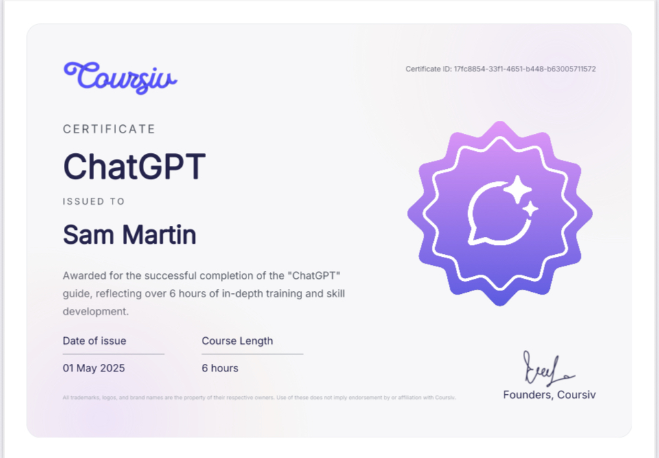
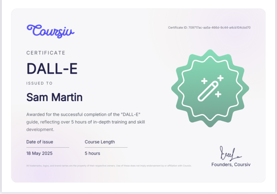
    The Coursiv master class isn’t overwhelming. That was the first surprise. Each certificate (I earned one in ChatGPT, one in DALL·E) was built to take about five hours. There’s no fluff—just a sequence of tutorials, short video explanations, hands-on practice, and quizzes that force you to actually use what you’re learning.

    This isn’t some overly technical course where you get lost in jargon. It’s approachable, but also detailed enough to matter.

    The ChatGPT portion focused on how the model processes language, how to give structure to your requests, and how to frame prompts that get clear, focused, and actionable output. The DALL·E portion leaned more into visual communication—how to layer descriptive elements, assign mood or composition, and work within the constraints of what DALL·E does well (and what it doesn’t).

    By the end of both certificates, I felt like I had a sharper grip on the levers. I could explain what I needed, why I needed it, and how to nudge the AI toward results that actually supported the work I was trying to do.

    “Coursiv Master Class in ChatGPT” + “Coursiv Master Class in DALL·E” – 10 hours of guided training and prompt optimization

    🔍 What Actually Changed in My Work

    The biggest shift was this: I stopped overcomplicating.

    Before the course, I was doing what I think most people do when they first start using AI: throwing everything at it. Too much detail. Too much explanation. Too many commands in a single breath.

    What I learned in the master class was that clarity doesn’t mean more words. It means the right words. It means giving the model context, a frame of reference, and a specific output to aim for—without layering on noise.

    Now, when I write prompts, I think in structure:

    • What do I want?
    • Who is it for?
    • What’s the tone, format, or constraint?
    • What shouldn’t it do?

    That last one is big. Most people don’t include negative prompts, but sometimes the only way to keep the AI in line is to tell it not to do something.

    Here’s a real-world before and after:

    🟥 Before Coursiv

    “Write a welcome email for my travel brand. Keep it fun and friendly. Include a list of offers.”

    🟩 After Coursiv

    “Write a welcome email in my voice (casual but professional) for new subscribers to Turquoise Tides Travel. These are solo travelers interested in tropical destinations. Keep the tone warm, not overly hyped. Include three bullets: 1) Free planning guide, 2) Custom vacation support, 3) Access to insider tips. Do not mention discounts or coupons.”

    Same request. Better output. Less editing afterward.

    🤖 But Then There’s the Friction

    Now for the real talk. Even with a perfect prompt, AI still gets it wrong. A lot.

    Sometimes it gives you more than you asked for. Sometimes it rushes ahead and fills in blanks you never meant to leave blank. Sometimes it adds “facts” that don’t exist or reorders your carefully planned flow.

    “It’s like asking a friend for help and they start building a treehouse when all you wanted was a hammer.”

    That’s not just a flaw in your prompt. It’s how machine learning works.

    These models are trained on massive datasets of human language. Most of that training leans toward helpfulness—finishing thoughts, inferring gaps, offering more than expected. So even when you try to be laser-focused, the model is still working off assumptions built into its foundation. It wants to guess. It wants to be useful.

    But sometimes that helpfulness is… annoying.

    That’s where I’ve had to build skill on top of the course—learning how to redirect, set limits, and break down big tasks into smaller, more controllable steps.

    🛠️ How I Handle That Now

    Here’s what changed in my workflow since the course:

    1. I break big prompts into sequences. Instead of asking for a full blog post outline and intro in one go, I ask for the outline first. Then I refine the outline. Then I ask for the intro based on the outline we just agreed on.
    2. I use feedback loops. I correct the model when it drifts: “That wasn’t what I meant. Remove the second paragraph and rewrite with a less promotional tone.” These loops save me more time than re-prompting from scratch.
    3. I build in constraints.
      • “Avoid repetition.”
      • “Do not reference God or spirituality.”
      • “Limit to 3 sentences per section.” These types of constraints actually work when you phrase them clearly.
    4. I remember it’s a tool, not a magic wand. I don’t expect brilliance. I expect scaffolding. It gives me a starting point, a structure to build from—and that’s plenty.

    💬 “The model doesn’t get to decide if something is right. I do.”

    💼 Real-World Wins (and Reality Checks)

    I’ve already implemented what I learned across several projects:

    • ShiverMedia blog outlines and guides I used refined prompts to structure multi-part guides like the Easy Guide to Email Marketing, speeding up my draft and editing phases.
    • Turquoise Tides Travel campaigns The welcome sequences, trip descriptions, and even Instagram captions are all improved by stronger prompting. I can create more consistent copy in my tone with less effort.
    • Salty Blue Mexico visuals While DALL·E is still limited when it comes to high-end design, it’s great for concepting. I now prototype visuals and build mood boards much faster than before.

    I’m also teaching my niece—who’s working with me this summer—some of the same tools. Her learning curve is shorter because I can show her what actually works, instead of throwing her in the deep end.

    But I’ll be honest. There’s still friction.

    Even with all that, AI isn’t consistent. The same prompt doesn’t always return the same result. Sometimes a well-framed input works beautifully, and sometimes it gives you a mess.

    You still have to show up as the creative director, the editor, the producer.

    The tool helps—but it doesn’t replace.

    🧭 Who Should Take the Coursiv Class?

    If you’re brand new to AI, the Coursiv class is an ideal starting point. It’s clear, approachable, and fast enough to not feel like another course you’ll never finish.

    If you’ve been using ChatGPT or DALL·E casually but want more control? Definitely worth it. It’ll tighten your prompts and help you stop relying on trial and error.

    If you’re already a power user? You may still benefit—especially if your results are inconsistent or you’re using AI for content creation, branding, or client-facing work.

    But it won’t turn you into an AI genius. That’s not the point.

    🔖 “It gives you tools. You still have to build the house.”

    📌 Final Thoughts

    Here’s what I took away from the whole thing:

    • You don’t need to be an expert to use AI well
    • Clear prompts matter, but clarity is more about intent than word count
    • Machine learning isn’t magic—it’s math. And sometimes it gets it wrong.
    • The value of AI is in the hands of the person using it

    I don’t feel like AI made me less creative. If anything, it gave me more room to experiment. More bandwidth. More space to try things and pivot quickly.

    That said, I’m also not under any illusion that the model will ever “get” me fully. It’s not supposed to. That’s my job. That’s the human part.

    And if you’re working in digital media today—whether you’re building a brand, running a campaign, or trying to stay ahead of the curve—knowing how to collaborate with AI is no longer optional. But letting it run the show? That’s a mistake.

    I still start every prompt with intention. I still edit every output.

    And I still believe the best work comes from the space between the tool and the hand holding it.

    🧩 “I took the course to get better at AI. What I really got was better at being clear—with my work, with the tools, and with myself.”

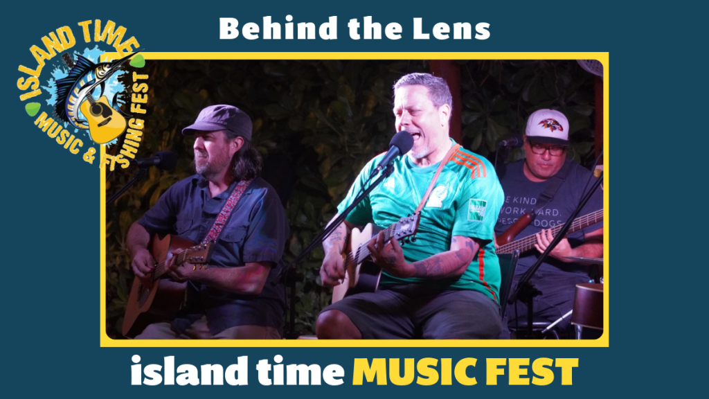
  • Behind the Lens – Island Time Music Fest

    Behind the Lens – Island Time Music Fest


    Three Days, Five Venues, Countless Moments – Capturing the Heartbeat of a Festival with Purpose

    There’s something about February on Isla that feels different. The air still carries that off-season calm, but there’s a slow build — a current — a feeling that something big is coming. If you know, you know.

    For me, it hits the moment I start charging batteries and clearing SD cards. That pre-show electricity that hums just beneath the surface. Because when the Island Time Music Festival rolls into town, this quiet little island turns into something else entirely.

    This was my second year covering the festival with Shivermedia. I signed on again to shoot video, snap photos, and manage social media for the festival — posting live, capturing energy, and sharing moments in real time while also preserving them for what comes after. Sounds simple. But behind the scenes, it’s a full-on sprint.

    The Build-Up Begins Long Before the Music

    Before a single note gets played, there’s a small crew working stateside, making sure the whole thing can even happen. Shellee (the champion of the festival), Skip, and Taylor — they’re the heartbeat of the production team. Every flight booked, every artist wrangled, every wristband counted, every fundraiser coordinated — it’s them. They’re not just event organizers; they’re miracle workers with day jobs, pulling this all together out of pure passion and a deep love for both this island and the cause that drives it.

    What most people don’t see is how much happens before anyone ever steps on a plane. It’s weeks, sometimes months, of coordination. Of spreadsheets, shipping snafus, phone calls, and last-minute pivots. And they do it not for glory, but for something much bigger.

    What We’re Really Here For: The Little Yellow Schoolhouse

    This isn’t just a music festival. Island Time exists to support the Little Yellow Schoolhouse — a nonprofit here on Isla Mujeres that provides education and therapy for children with disabilities. It’s a special place. Quiet, powerful, and deeply loved by the community. And it’s the reason artists fly in, volunteers sign up, and venues open their doors.

    When you walk through the school’s gates, it’s impossible not to feel it. The walls are painted bright, the classrooms are small, and the work being done inside is life-changing. Therapists, teachers, and staff stretch limited resources as far as they can — but the need is always greater. That’s where the festival comes in.

    And this year, when a few of the artists visited the school and played for the kids? That was it. That was the moment. The kids danced, clapped, beamed. Pure joy. No stage, no ego, just a shared moment. A reminder that the music matters, but the mission matters more.

    5 Venues. 3 Days. One Island-Wide Pulse.

    This year’s lineup spanned five unique venues across Isla Mujeres: el Borracho Burro Cantina, Hacienda Caribe, Tiny Gecko, KinHa, and Zama Beach Club — each one adding its own personality to the experience.

    el Borracho Burro Cantina is like the island’s version of Cheers — tucked into the jungle with an open-air bandshell and daily good vibes. It’s welcoming, relaxed, and absolutely alive when the music kicks in. The kind of place where the bass feels grounded in the dirt and every face feels familiar.

    Tiny Gecko kicked things off with a proper launch — a street party with the stage on the street outside the venue the crowd danced spilling over to the malecon. Artists and attendees moved together like one current, music echoing off the buildings, people dancing wherever they could find space. That night set the tone: loose, loud, and completely in the moment.

    Hacienda Caribe brought a slower, breezier rhythm — a pool party set against a Caribbean backdrop, casual and intimate, with DeNuccio’s providing food for the VIPs and that unmistakable ocean breeze rolling through the space. It felt like a secret spot you were lucky to be invited to.

    KinHa turned into an all-day beach club jam. With plenty of space, solid food, and room to lounge, dance, or float, the energy rolled from midday sun into golden hour without missing a beat. You could feel the music without ever leaving your chair — or dive into it headfirst.

    And finally, Zama Beach Club closed it all down. The last night of the festival, under a velvet sky, the big stage glowing, the sea just steps away. You could feel the whole crowd exhale as the final notes rang out — a kind of joyful exhaustion wrapped in gratitude and salt air.

    The Nashville Vibe, Isla Style

    There’s a soul to this festival that goes deeper than the palm trees and the playlists. It’s the Nashville thread — that raw, heartfelt, unpolished realness that runs through every set, every lyric, every busted string. And this year, the lineup brought it hard.

    Clayton Anderson, Runaway June, Izzy Malek, Jimmie’s Chicken Shack, Tenille Arts, Filmore, Tera Lynne Fister, Jon Stone, Love & Theft, Logan Mize, Nakessa, Maggie Rose, Emily West, Trent Tomlinson, and Leah Turner — each one showed up, not just to perform, but to give. They volunteered their time, brought their gear, their grit, and put on a helluva show at every stop.

    Some are familiar faces — the ones who come back year after year because they believe in what this festival stands for. Others were new to Isla, wide-eyed and maybe a little unsure, until the crowd wrapped around them and they found their groove in the sea air. By the end, they were family too.

    This isn’t a commercial gig. There’s no red carpet, no massive rider. Just island vibes, barefoot stages, and an audience that’s close enough to touch the sound. That’s what makes it work. That’s why they keep coming back. And why we’ll keep showing up, year after year, to hear them play.

    Working the Festival: Behind the Scenes, Behind the Phone, Behind the Lens

    My role is a strange mix of autonomy and immersion. I’m not front and center, but I’m everywhere — moving fast, posting live when possible, catching the right angles while staying invisible enough not to interrupt the moment. There’s no one directing. No headset or checklist. Just the camera, a content plan, and the instinct to capture what feels true.

    There’s no tent, no media lounge, no production trailer. It’s just me, my gear, my instincts, and a deep sense of responsibility to do this justice. Sometimes it meant filming while pressed up against a speaker stack. Other times, crouching behind tables or halfway into tree beds just to stay out of sight and get the shot. Water bottles left behind. Sweat dripping. Airdropping clips between devices while uploading content from shady corners of courtyards with barely-there WiFi.

    This kind of work doesn’t come with applause — it’s not meant to. It comes with presence. With trusting yourself to show up fully, work independently, and let the story tell itself.

    You learn to work fast. To stay loose. To find beauty in imperfection. You miss meals, miss the show while you’re shooting it, and miss sleep reviewing the days content, cleaning thecardsand setting up for the next days venue.

    You don’t miss the meaning. You feel it, even when you’re exhausted.

    The Volunteer Force That Keeps the Wheels Turning

    If you’ve ever wondered how a festival like this actually holds together — with artists moving between venues, volunteers showing up in the right place, credentials getting checked, people getting fed, and content going up close to live — the answer, in two words, is Laura and Karen.

    They coordinate the volunteer team here on the island. From organizing passes to assigning shifts, making sure artists get where they need to be, and even getting me better internet mid-show so I could keep posting in real time — they don’t stop. They’re in constant motion, solving problems before most people even notice there is one.

    And the wild part? They make it look easy.

    But what really makes it work — what makes the volunteer crew such a solid force — is the relationships Laura and Karen have built on this island. People show up for them. Again and again. Because they’ve earned that trust. That respect. That kind of leadership isn’t loud — it’s rooted. It’s consistent. It starts long before opening night and doesn’t end until everything’s packed up and done.

    This festival doesn’t run on luck. It runs on people like them.

    What the Camera Caught — and What It Didn’t

    The reels you’ve seen? The highlight videos? Those are just a fraction of it. What they don’t show is the downtime between sets, when artists laugh and share stories. Or the quiet way someone hands over a donation envelope without needing recognition. Or the family who comes every night, dancing at the edge of the crowd just to be close to it all.

    You don’t always film those moments. Sometimes they’re meant to be felt, not posted.

    The Real Work Happens After the Applause

    After the last song fades, that’s when my work really begins. The island sleeps, but I’m sorting through thousands of photos and clips, logging files, organizing timelines, and building something that reflects the truth of what just happened. It’s not just about the perfect shot. It’s about the rhythm — the story — the thread that ties it all together.

    I sit in my studio, sandy gear still unpacked, editing until my fingers go numb. Because this deserves care. This deserves attention. This isn’t content. It’s community.

    Why I’ll Keep Coming Back

    Every year, I wonder if I’ll be able to keep up with the pace. If the tech will cooperate. If the shots will land. If the stories will be told right. But every year, the people remind me why I show up.

    This is the kind of work I want to be doing. It’s not about followers or reach or polish. It’s about heart. About capturing something real — something that helps support kids, connect artists, and keep a beautiful tradition alive on this little stretch of sand.

    To Shellee, …the one everyone quietly knows is the backbone of the whole operation — the reason things work, even when they shouldn’t. Skip, Taylor — you make it all possible. To the artists — you bring the soul. To the venues — thank you for opening your doors and trusting the process. To the volunteers — you’re the reason this even works. And to the kids at the Little Yellow Schoolhouse — you are the why. Always the why.

    And to the crew, Much appreciation @cisnesFotografica

    I live here. This is home. And being able to document something this real, this good, right here where I swim every morning and work every day — that’s not lost on me.

    I’ll keep showing up. Camera in hand. Still sweaty. Still grateful.

    Still telling the stories that matter.

    Want to experience it for yourself?

    The full video recap is coming soon to Shivermedia’s YouTube and Instagram. Watch, listen, and remember what Island Time really feels like.

  • 5 Digital Downloads You Can Use as Lead Magnets

    5 Digital Downloads You Can Use as Lead Magnets

    When it comes to growing your business, specifically building a quality email list, using digital downloads as lead magnets is a game-changer. If you’re wondering what digital downloads or lead magnets are, and how you can leverage them to grow your business, well here we break it all down in simple terms.

    What Is a Digital Download?

    A digital download is any type of content, product, or file that can be delivered electronically—think eBooks, checklists, templates, and more. It’s a quick and easy way to provide valuable resources to your audience without dealing with physical products or shipping.

    What Is a Lead Magnet?

    A lead magnet is basically an incentive that you offer in exchange for a potential customer’s contact information, usually an email address. It’s like a trade—you provide something valuable and useful, and your audience gives you their info. This builds your email list with people who are genuinely interested in what you’re offering, making it easier to connect with them later.

    Why Digital Downloads Work as Lead Magnets

    Digital downloads work so well because they provide immediate value and establish your expertise in the eyes of your audience. They’re like a little taste of what you offer, building trust and interest. So, let’s get into the top five types of digital downloads that you can use to hook your audience.


    lead magnet examples

    The Best Digital Downloads to Grow Your Audience


    1. eBooks and Guides

    Why It Works: eBooks and guides are perfect for diving into a specific topic and showing off your expertise. They’re educational and often help solve a pain point for your audience.

    Example from the Real World:
    HubSpot, a leader in inbound marketing, offers eBooks like “The Ultimate Guide to Social Media Marketing.” It’s detailed, actionable, and packed with value—making it a must-download for marketers looking to up their game. By offering such robust resources, HubSpot not only grows its email list but also nurtures leads that could become customers.

    How You Can Apply It:
    Let’s say you’re a fitness coach. Create an eBook like “10 Ways to Boost Your Metabolism.” Include actionable tips, recipes, and exercises. Promote it as a free resource for subscribers, and you’ll attract people looking to improve their health—your ideal audience.

    Pro Tip: Keep your design polished and professional. Tools like Canva or Adobe Express make it easy to create visually appealing eBooks without a design degree.


    2. Checklists and Cheat Sheets

    Why It Works: Checklists are practical, to-the-point, and easy for people to use. They provide a clear roadmap to solving a problem or completing a task.

    Example from the Real World:
    The travel blog Nomadic Matt offers a “Packing Checklist for Budget Travelers” as a free download. It’s a simple resource that addresses a common traveler pain point—what to pack for trips. By solving this problem, Nomadic Matt builds a list of engaged travel enthusiasts who are likely to purchase his guides or attend his courses.

    How You Can Apply It:
    Imagine you run a photography business. Offer a free “Wedding Photography Checklist” for couples planning their big day. Include key moments to capture, tips for working with photographers, and questions to ask before hiring one. This positions you as a helpful resource, even if they don’t hire you immediately.

    Pro Tip: Keep your checklist simple and well-organized. Include visuals or icons to make it more engaging.


    3. Templates and Swipe Files

    Why It Works: Templates and swipe files save your audience time by giving them pre-built solutions they can customize. These are ideal for industries where people often start projects from scratch.

    Example from the Real World:
    CoSchedule, a marketing platform, provides a “Social Media Content Calendar Template” to help marketers organize their campaigns. By offering this, CoSchedule attracts potential users to its platform while showcasing the value of its tools.

    How You Can Apply It:
    If you’re a business coach, create a “Business Budgeting Template” in Excel or Google Sheets. Small business owners can easily download and use it to manage their finances, and you’ll establish trust by solving a real pain point.

    Pro Tip: Format your templates in widely used tools like Google Docs or Canva to ensure they’re accessible to the largest audience possible.


    4. Workbooks and Planners

    Why It Works: Workbooks engage your audience in a hands-on way. By walking them through exercises or planning activities, you provide a personalized experience that they can revisit over time.

    Example from the Real World:
    The fitness brand Tone It Up offers a “7-Day Meal Planner Workbook” as a free lead magnet. Subscribers can download it, plan their meals for a week, and incorporate Tone It Up’s recipes and fitness challenges into their lives. This keeps the brand top-of-mind while helping subscribers achieve their goals.

    How You Can Apply It:
    Suppose you’re a mindset coach. Offer a “30-Day Goal Setting Workbook” with prompts and exercises to help people clarify their goals and track their progress. Include sections for reflection, tips, and motivational quotes to keep them engaged throughout the month.

    Pro Tip: Make your workbook interactive by including fillable PDF sections or linking to additional resources like videos or blog posts.


    5. Free Courses and Video Tutorials

    Why It Works: Video is one of the most engaging types of content. By offering a free course or tutorial, you give your audience a chance to learn directly from you while showcasing your expertise.

    Example from the Real World:
    Skillshare, an online learning platform, uses free trial courses as lead magnets. For example, “Introduction to Graphic Design” is a popular course that lets users experience the platform’s value before committing to a subscription.

    How You Can Apply It:
    If you’re a graphic designer, offer a short tutorial titled “How to Create Eye-Catching Instagram Graphics in 10 Minutes.” Include actionable steps and practical tips that viewers can implement immediately. Once they see how much they’ve learned, they’ll be more likely to invest in your paid services or courses.

    Pro Tip: Keep your video tutorials short (under 10 minutes) and focused on one clear takeaway. Use tools like Loom or Canva Video to record and edit professional-looking content.


    How to Promote Your Lead Magnets

    Having an amazing lead magnet is only half the battle—you also need a strategy to get it in front of your audience. Here are some tips:

    1. Optimize Your Website: Use pop-ups, banners, or dedicated landing pages to showcase your lead magnets. For example, add a banner that says “Download Our Free ‘10 Ways to Boost Your Metabolism’ eBook” at the top of your homepage.
    2. Social Media Ads: Run targeted ads that highlight the value of your lead magnet. A short video ad demonstrating the freebie can drive high engagement.
    3. Collaborate with Influencers: Partner with influencers in your niche to promote your lead magnet to their audience. This works well if their followers align with your target market.
    4. Leverage Email Marketing: Use your existing email list to spread the word. Offer the lead magnet to loyal subscribers as a way of saying thanks.

    Final Thoughts

    Digital downloads are a powerful way to attract and engage your audience. Whether it’s an in-depth eBook, a practical checklist, or a hands-on workbook, the key is offering something that solves a real problem for your ideal customer.

    By taking inspiration from these real-world examples, you can create lead magnets that not only grow your list but also establish your credibility and keep your audience coming back for more.

    Start creating one of these today, and you’ll be one step closer to turning clicks into lasting connections.

    Want to learn more or hire a professional? Contact me @thesamimartin on the social network channels!

  • 5 Best Onboarding Email Practices

    5 Best Onboarding Email Practices

    Building Relationships and Driving Conversions

    In the digital age, onboarding emails are one of the most powerful tools a business can use to establish relationships with new subscribers and guide them through their customer journey. These emails provide a structured introduction to your brand while laying the foundation for trust, engagement, and conversions.

    At Shiver Media, we’ve seen firsthand how a well-thought-out onboarding strategy can make or break the first impression. By welcoming new subscribers with tailored messaging and clear value, businesses can transform curious prospects into loyal customers. Let’s dive deeper into what makes a stellar onboarding email sequence, along with examples from projects we’ve crafted for clients across industries.

    customer relationships

    Why Onboarding Emails Matter

    Before we jump into best practices, it’s worth emphasizing why onboarding emails are so impactful. These emails serve as the first touchpoint after a subscriber opts into your list. Beyond welcoming them, they also:

    • Confirm interest through a double opt-in process.
    • Set expectations about future communications.
    • Establish credibility and authority.
    • Nurture leads toward purchasing decisions.

    The double opt-in is particularly crucial. It ensures your subscribers are genuinely interested and helps keep your email list clean, protecting your domain’s reputation and improving deliverability rates. Your first email should include a warm welcome and a request for confirmation. Once confirmed, you can start engaging with meaningful, targeted content.

    When consulting or coaching, we emphasize balancing authenticity with strategic goals, a formula that’s worked across industries like e-commerce, coaching, and hospitality. By segmenting audiences and tailoring the messaging, our clients have seen substantial growth in both engagement and revenue.


    1. The Welcome Sequence: Setting the Stage for Success

    The first email your subscribers receive is the gateway to their journey with your brand. A well-designed Welcome Sequence ensures that their first impression is impactful, informative, and engaging.

    Why It Matters

    Your subscribers are at their most interested and curious right after signing up. The Welcome Sequence capitalizes on this moment by introducing your brand, highlighting the benefits of staying connected, and setting expectations for future emails.

    Welcome sign on a table in a lobby with a bright room in the background

    Crafting an Effective Welcome Sequence

    • Double Opt-In Confirmation: Ensure compliance with regulations like GDPR, CASL and CAN SPAM while filtering out invalid or uninterested subscribers. A double opt-in email confirms their subscription and adds an additional layer of trust.
    • Warm Introduction: The first email should welcome them warmly, thank them for subscribing, and provide a glimpse into what they can expect from your content or services.
    • Showcase Your Brand’s Value: Highlight your unique selling points. Whether it’s a free resource, an exclusive offer, or a link to valuable content, make it clear why they’ve made the right choice in subscribing.
    • Encourage Interaction: Include links to your most popular blog posts, social channels, or tutorials, encouraging them to explore and engage further.

    Real-Life Example: ShiverMedia’s Approach

    We’ve created Welcome Sequences for numerous clients, tailoring each to their audience. For one client, we started with a friendly “Thanks for Joining!” email, which included a special discount code, followed by a second email introducing the brand’s story and values. The result? A 40% increase in first-week engagement.

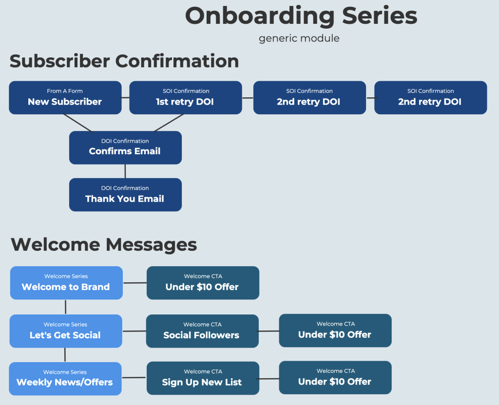
    1. Start with a Clear Strategy

    The foundation of any successful onboarding series is a well-defined strategy. These emails should be more than just a polite hello—they should introduce your brand, build trust, and move subscribers closer to taking action.

    Key Elements of a Welcome Strategy

    • Set the Tone: Ensure your brand voice shines through. Whether it’s playful, professional, or heartfelt, your tone sets the stage for future interactions.
    • Build Momentum: Keep subscribers engaged with a logical progression from one email to the next.
    • Drive Action: Every email should have a clear call to action (CTA), whether that’s to explore your website, download a guide, or make a purchase.

    Pro Tip: A strong first email introduces your brand’s story, encourages interaction, and creates excitement. The first email should spark curiosity—it’s the handshake that begins the relationship.

    2. Confirm Interest and Deliver Value

    How to Deliver Value

    • Educational Content: Share a guide or tutorial relevant to your audience.
    • Promotional Offers: Provide a discount code or a free trial to encourage purchases.
    • Supportive Resources: Link to FAQs or how-to videos.

    For example, one of our clients in the hospitality industry saw a 25% boost in bookings after incorporating personalized travel tips and local guides into their onboarding emails.


    3. Tell Your Story

    Storytelling is an underrated yet powerful tool in onboarding emails. It’s an opportunity to showcase your authenticity and connect with your audience on a deeper level.

    Crafting a Story Sequence

    Our approach to storytelling often involves a “low point to breakthrough” narrative:

    • The Challenge: Share a relatable struggle that resonates with your audience.
    • The Epiphany: Highlight the turning point that led to your brand’s creation or success.
    • The Resolution: Demonstrate how you or your products/services solved the problem.

    One standout example is a coaching client we worked with who shared their journey from burnout to balance. The story resonated with subscribers, leading to a 35% increase in course sign-ups.

    Pro Tip: End your story sequence with a cliffhanger, inviting subscribers to look out for the next email. For instance, tease an exclusive offer or resource they won’t want to miss.


    4. Introduce the First Purchase Offer

    Timing is everything when it comes to introducing your first pitch. After nurturing your subscriber through the first few emails, it’s time to present an offer they can’t refuse.

    How to Make the Pitch

    • Soft Approach: Frame the offer as a thank-you for joining your community.
    • Hard Approach: Use urgency and scarcity, such as “Limited-time offer—expires in 48 hours!”
    • Social Proof: Incorporate testimonials or reviews to build trust.

    In our experience, the sweet spot for introducing a first purchase offer is email 3 or 4. For example, a fashion brand client used a “Welcome Discount” campaign to convert 40% of new subscribers into customers within the first week.

    Pro Tip: Follow up purchase emails with tracking information and a thank-you note to reinforce trust and encourage repeat purchases.


    5. Create an Engaging Design

    Design is often overlooked but plays a critical role in how onboarding emails are perceived. Clean, professional design enhances readability and encourages action.

    Design Best Practices

    • Mobile Optimization: Ensure your emails are responsive and look great on all devices.
    • Strong CTAs: Use buttons instead of text links for better visibility and click-through rates.
    • Visual Hierarchy: Make important elements like headlines and CTAs stand out.

    We consistently emphasize the value of storytelling in onboarding emails. For example, a food blogger crafted a story-driven campaign about her journey discovering unique spices during her travels. Each email featured vibrant images of the spices paired with engaging text about their origins and uses. This captivating sequence resonated with her audience, leading to a 60% increase in lead generation conversions compared to her previous, less narrative-driven


    Bonus Sequences: Going Beyond the Basics

    Once your onboarding series is up and running, consider adding specialized sequences to deepen relationships and re-engage inactive subscribers.

    Storytelling Sequence

    Our storytelling sequences often explore the journey of building a brand, from struggles to triumphs. These emails:

    • Build emotional connections with subscribers.
    • Highlight the values and mission behind your brand.
    • Encourage readers to see your brand as more than a product or service provider.

    Re-Engagement Sequence

    Target subscribers who haven’t opened your emails or made a purchase in a while. Offer them a compelling reason to come back, such as:

    • Exclusive discounts.
    • Personalized product recommendations.
    • Engaging content, like a popular blog post or webinar replay.

    Real-World Results from Shiver Media

    Over the years, we’ve fine-tuned onboarding strategies for clients across industries. A few standout successes include:

    • E-Commerce Client: A playful welcome series with humor and GIFs led to a 45% open rate and a 20% conversion rate.
    • Coaching Business: A deeply personal story sequence built trust and resulted in a 30% increase in course sign-ups.
    • Travel Agency: Offering free destination guides in the first email boosted engagement rates by 60%.

    Final Thoughts

    Onboarding emails are your chance to make a lasting first impression and nurture subscribers into loyal customers. By implementing these five best practices—starting with a clear strategy, confirming interest, delivering value, telling your story, introducing an offer, and focusing on design—you can create a sequence that stands out in today’s crowded inboxes.

    Athoughtful and authentic approach to onboarding can deliver remarkable results. Whether you’re a coach, e-commerce retailer, or travel agency, investing time in crafting a meaningful onboarding sequence is a surefire way to build connections and drive conversions.

    Now, it’s your turn. Start refining your onboarding strategy today, and watch your email marketing efforts transform.

    OR Reach out and we can get your sequences locked in for you in a short time. Watch the leads generate revenue quickly.


  • 5 Ways to Build an Email List

    5 Ways to Build an Email List

    The Best 5 Strategies to Build a Targeted Email List for Your Brand Product or Service

    Building an email list is a key aspect of marketing your brand, products or services online.With these strategies youare on your way to building a qualified list. Let’s dive into each method with a real-life example that illustrates how each can work for you.

    webfomrEample
    1. Opt-In Forms: Simplify Sign-Ups
      Opt-in forms are a straightforward way to encourage visitors to join your email list. Place them strategically on your website or product pages and offer a compelling incentive, like a discount or free download, to entice sign-ups. Here’s an example of an opt-in form featuring an incentivized offer:

      Imagine you run an online boutique selling handmade jewelry. You want to collect the email addresses from the visitors to your websiteOn your website, you feature an opt-in form offering a 15% discount to new subscribers. A visitor browsing your site comes across the form while admiring your collection and decides to sign up to receive the discount. Not only have you gained a new subscriber, but you’ve also incentivized them to make a purchase with their exclusive discount.

    2. Content Upgrades: Offer Value
    Enhance your email list with valuable content upgrades, such as ebooks or guides, offered exclusively to subscribers. Provide a visual teaser, like an ebook cover, to showcase what subscribers can expect.

    Let’s say you’re a fitness coach specializing in at-home workouts. You create a comprehensive guide to “30 Days to a Healthier You” and offer it as a content upgrade to subscribers. Visitors to your website who are interested in improving their fitness journey sign up for your email list to receive the guide. They not only gain valuable insights but also see you as an authority in your field, strengthening their trust in your brand.

    Content Strategy concept on notebook with many light bulbs

    3. Social Media: Expand Your Reach
    Let’s say you’re a food blogger sharing delicious and nutritious recipes on your blog. You create visually stunning recipe cards and share them on your social media platforms, inviting followers to subscribe to your weekly newsletter for more recipes and cooking tips. Food enthusiasts intrigued by your mouthwatering creations eagerly sign up for your newsletter to receive regular updates. With engaging visuals and enticing content, you expand your reach and grow your email list organically. Imagery suggestion: A captivating social media post featuring a recipe card and a call-to-action.


    4. Referral Programs: Incentivize Sharing
    You’re the owner of a subscription-based grooming products company. To encourage word-of-mouth referrals, you introduce a referral program where existing subscribers can earn a free product for every friend they refer who signs up. One of your satisfied customers shares their referral link with their social circle, and several friends sign up for subscriptions. Not only do you gain new subscribers, but you also reward loyal customers for spreading the word about your brand. Imagery suggestion: A graphic promoting the referral program with clear instructions.

    5. Webinars: Educate and Engage
    As a software company, you decide to host a webinar titled “Mastering Productivity: Tips for Remote Teams.” You promote the webinar across your social media channels and through targeted email campaigns. Interested professionals in remote work sign up for the webinar to learn valuable strategies for boosting productivity in their teams. By collecting email addresses during registration, you not only provide value but also grow your email list with engaged prospects interested in your products or services. Imagery suggestion: A promotional graphic highlighting the webinar topic.

  • Integrating AI Into Design Flow

    Crafting a Logo for Tammy and Sam’s RV Adventure Home: CoconutRVAdventures.com

    This summer, my girlfriend Tammy and I will embark on an adventure as remote workers and vloggers, navigating the open road while documenting our experiences as a digital marketer and a traveling nurse. Our home on wheels, a Class C Jayco GreyHawk affectionately named Coconut, inspired the idea to build a website, project to create a logo for the RV and website, CoconutRVAdventures.com. The logo needed to capture the spirit of our upcoming journey.

    As the designer, I was tasked with bringing this vision to life and decided to embrace the challenge of integrating AI into the design process. Here’s my step-by-step guide, blending hand-drawn sketches with the power of Adobe Firefly, Adobe Photoshop and Adobe Express to create a logo that captures the essence of our RV lifestyle and invites others to join our journey.

    Step 1: Sketching Ideas with Procreate

    Being your own client is never easy. I started by sketching logo ideas in Procreate, visualizing the core elements Tammy and I envisioned: RV imagery, tropical beach themes, mountains, camping, and symbols of freedom and travel. Integrating AI into the project brought both excitement and uncertainty. I wanted to ensure the design felt authentically mine, despite concerns about plagiarism and doubts about the final outcome. This sketching process served as the blueprint for the digital work.

    There were additional iterations, but I won’t go into much detail on those sketches as I’ve posted about this process before. Essentially, I start with the first design that stands out. In Procreate, I recorded the process of rough sketching. Back in art school in the early ’90s, this involved using sheets of paper and markers. Procreate allows me to work much faster with no pencils and direct erase.

    For more on my digital drawings and to view a gallery of sketches, check out the article on my personal site. I hope you enjoy it!

    Step 2: Importing to Firefly

    After importing the sketch into Adobe Firefly, using it as a reference for the logo’s structure, I crafted a prompt that I believed would return a cleaner version of my drawing. This was not entirely the case. Though I did get pieces of things I really liked. I was also impressed at how the generation was able to mimic my drawing style. However, back to the prompt.

    The first prompt and results looked like this:
    “create a logo that includes a Class C RV Jayco GreyHawk sitting on a scee that is placedinside and spilling out of a coconut half shell. Looking like it is done in marker the main colours will be teal and purple”

    Additionally, I set the style to “digital art” and the structure with the image reference to “graphic design”. I then clicked the AI’s generation process. This involved refining the prompts over a few attempts to see if I could get a result that aligned with my vision. It was essential to maintain the integrity of my original concept while leveraging AI to enhance and expedite the creative process.

    Step 3: Refining Prompts with ChatGPT

    To enhance the prompts used in Firefly, of course I turned to ChatGPT to refine the instructions. This included describing the specific RV model, emphasizing the use of a vibrant color palette with teal blues and rich purples, and incorporating tropical elements.

    Here is the revised prompt and the results
    “Generate a logo featuring a Class C RV, Jayco GreyHawk, nestled within a scenic backdrop emerging from a halved coconut shell. The style should resemble marker art, with predominant colors of teal and purple.”

    This step helped ensure that the generated logos closely matched the vision for CoconutRVAdventures.com and allowed for greater precision and creativity in the design process.

    It took a few tries with different but fairly similar prompts. The changes were nuanced, like specifying a Ford 450 front grill or the exact model of the RV. Sometimes, I would get a new image and swap out the style to match one of the generated images.

    I was making progress, though not quite there yet. After refining the prompt one final time, I finally got the design I wanted. With that in hand, I moved on to the next stage: taking it into Adobe Express to play around with text and other elements.

    “Generate a logo featuring a coconut half shell containing a beach break wave with a sunset in the background. Include mountains behind the sunset and a palm tree. Make a Class C RV the central focal point within the design”

    Step 4: Refining in Photoshop and Express

    After generating the logo in Firefly, I imported it into Adobe Photoshop for further refinement. This involved cleaning up the design, removing unnecessary backgrounds, and using the generative fill feature combined with more of my pencil work, I was able to enhance and create different elements like the sunset circle in the background. Additionally I was not happy with the RV pictured above. Unfortunately I was not able to screen capture the photoshop work however when I was done I had the following iteration. I was getting so much closer.

    The refined logo was then pulled into Adobe Express to work on the typography, experimenting with different fonts until the perfect match was found that complemented the visual elements of the logo.

    Step 5: Exporting the Final Logo

    Once satisfied with the design, I exported the final logo in high-resolution formats suitable for both web and print. This ensured that CoconutRVAdventures.com had a distinctive and polished logo that effectively represented Tammy and Sam’s adventurous lifestyle.

    Conclusion

    Creating a distinctive logo for CoconutRVAdventures.com using a combination of hand-drawn sketches and advanced AI tools was an exciting journey. If you have thoughts on using AI to generate logos from sketches or opinions on Tammy and Sami’s new logo, let’s start a conversation. Share your insights and let us know what you think about the final design!