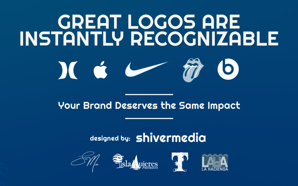
Creating a logo isn’t about decoration—it’s about alignment. Alignment between vision and visuals. Between who you are and how you show up. Between the business you’re building and the story you’re telling.
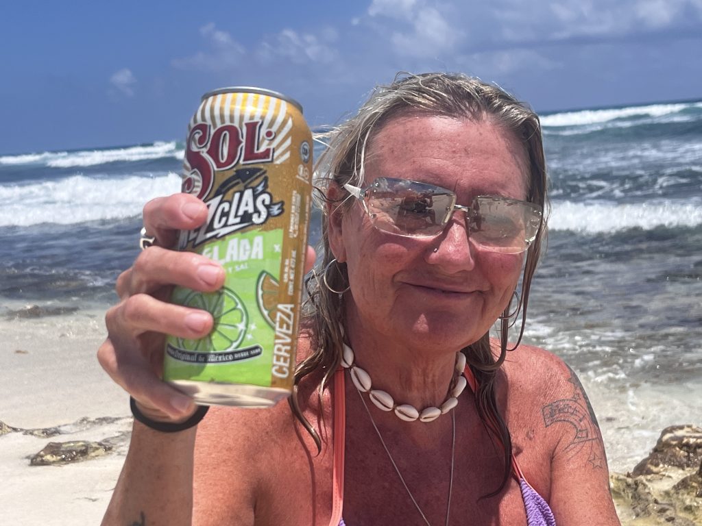
For Turquoise Tides Travel, a brand born from the midlife reinvention of a soon-to-retire nurse named Tammy, this was about more than travel. It was about transformation. This project wasn’t just a logo design—it was an honour to visually interpret someone’s leap from service to self-direction.
This is the story behind the brand. A real-world breakdown of how ShiverMedia brought Turquoise Tides Travel to life.
1. Pre-Design Discovery: From Nurse to Navigator
Tammy came to me with a vision, not a brand. That’s often the case—and it’s exactly how it should be.
In our first conversation, we talked less about fonts and more about feelings. Tammy, a seasoned nurse stepping into retirement, wasn’t looking to slow down. She was looking to evolve. Her new business would cater to other women like her—those on the “backline of midlife,” looking for freedom, adventure, and meaning in travel.
She’d already chosen the name: Turquoise Tides Travel.
She was drawn to the Mexican Caribbean—those unreal turquoise blues that shimmer just off the shores of Isla Mujeres and Cozumel. There was a lot of emotional resonance there: peace, clarity, reinvention. That became the foundation.
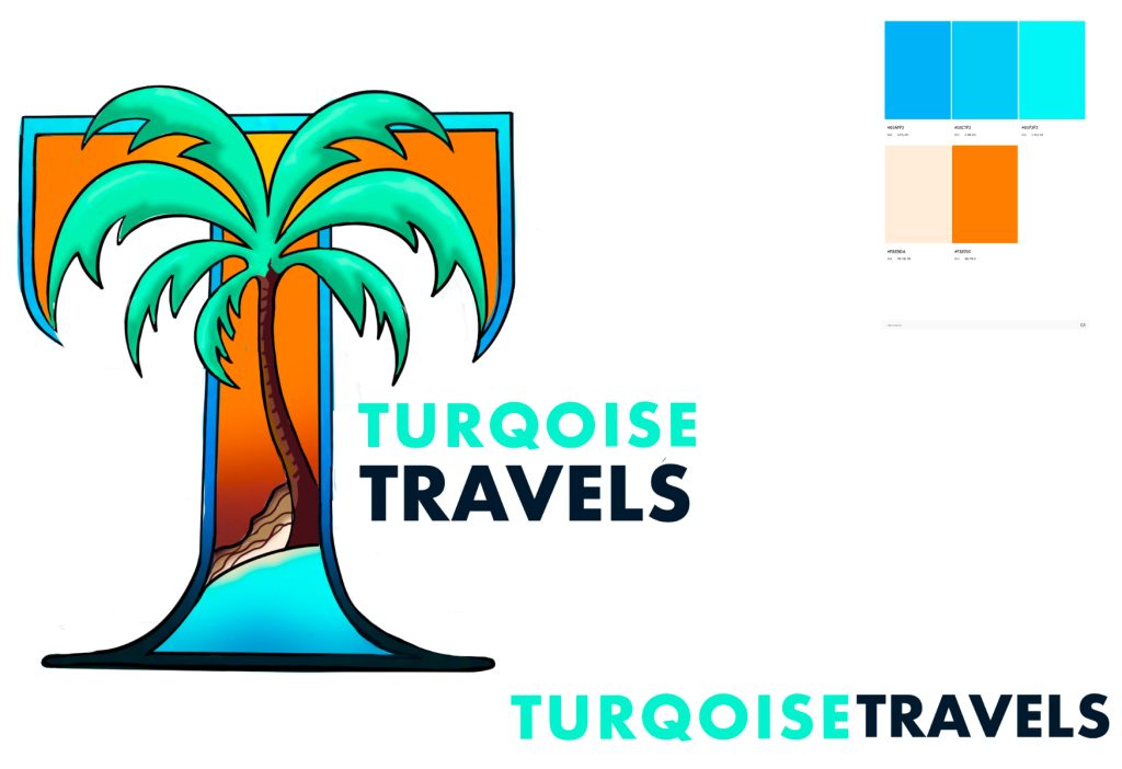
We talked colour, tone, and especially the “T.” The letter stood out to Tammy—it was personal, rooted in both her name and her new venture. That gave us a clear design cue: whatever we made, the T had to mean something.
Before we even opened Illustrator, we ran a few initial concepts through ChatGPT’s logo ideation prompts to get rough direction. Some were generic. Some sparked something. But the best ideas came out of sketching, iterating, and leaning into what felt right—not what a trend predicted.
2. Early Concepts: AI Meets Human Touch
Design always begins messy.
The first round of ideas came from combining prompts with visuals—using ChatGPT to describe visual metaphors like tidal loops, water lines, signature strokes, and soft-feminine adventure motifs. These outputs gave us some grounding to explore the brand’s possible directions.
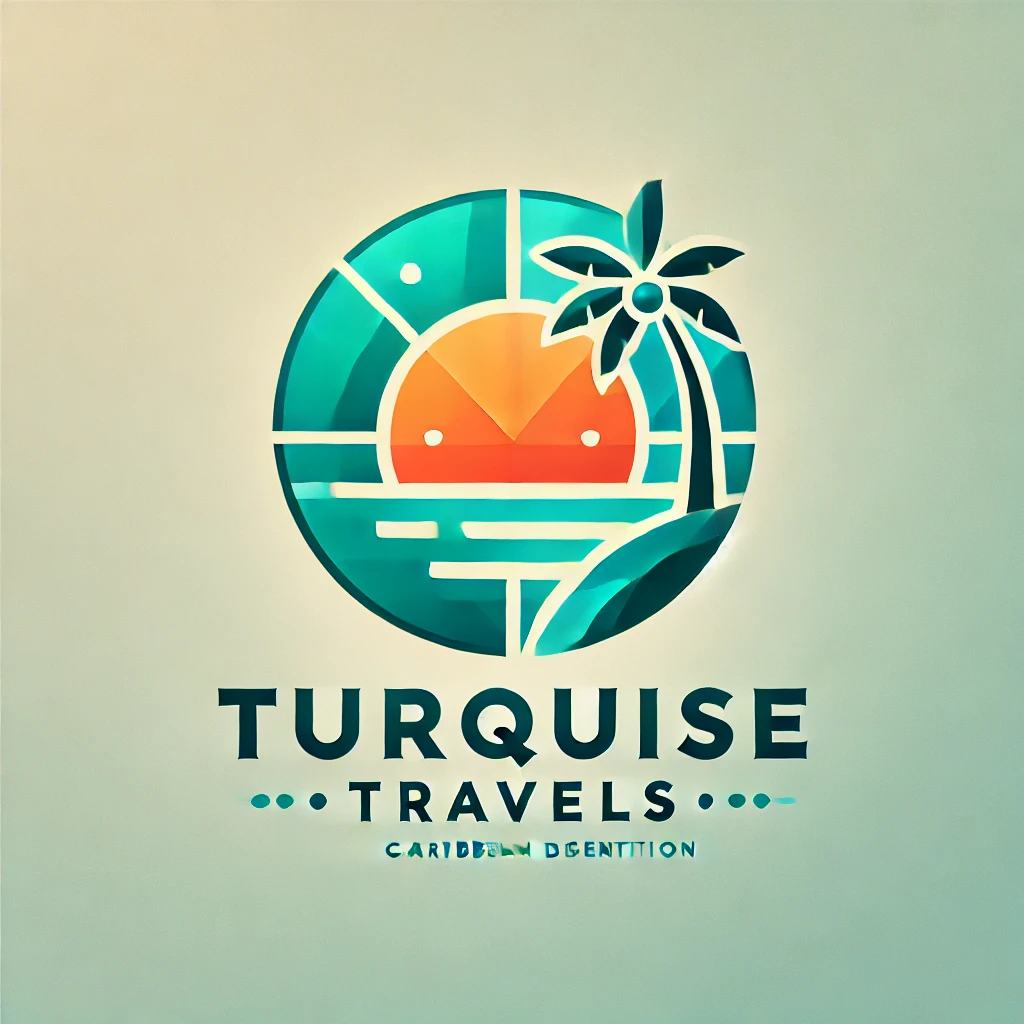
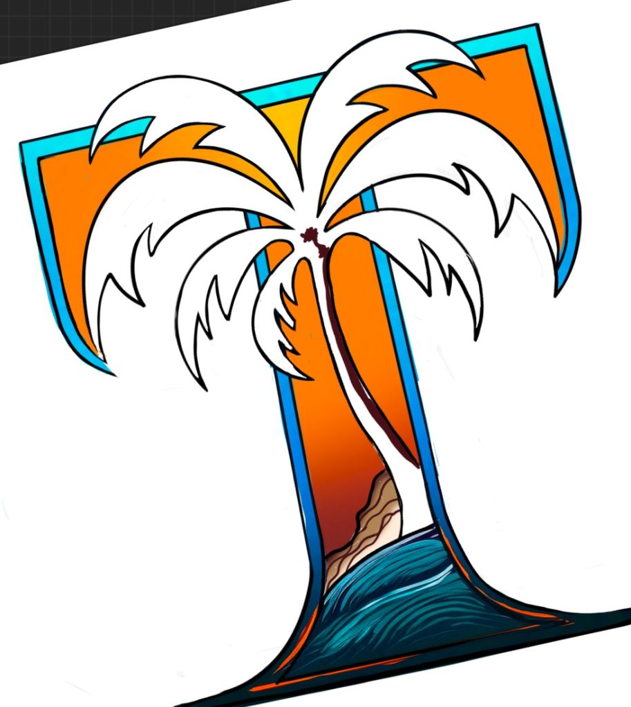
But the magic always lives in the human hand. I sketched alternatives by hand, keeping the “T” as a central symbol, exploring wave-like motion and ink-stamp feels. Some sketches were literal: wave crests and compass points. Others leaned abstract: fluid loops forming soft Ts.
That’s when it clicked.
We didn’t want a “beachy” logo. We wanted a mark that spoke to the fluidity of life. A tide that wasn’t crashing, but flowing. Graceful. Free.
From there, we refined four directions:
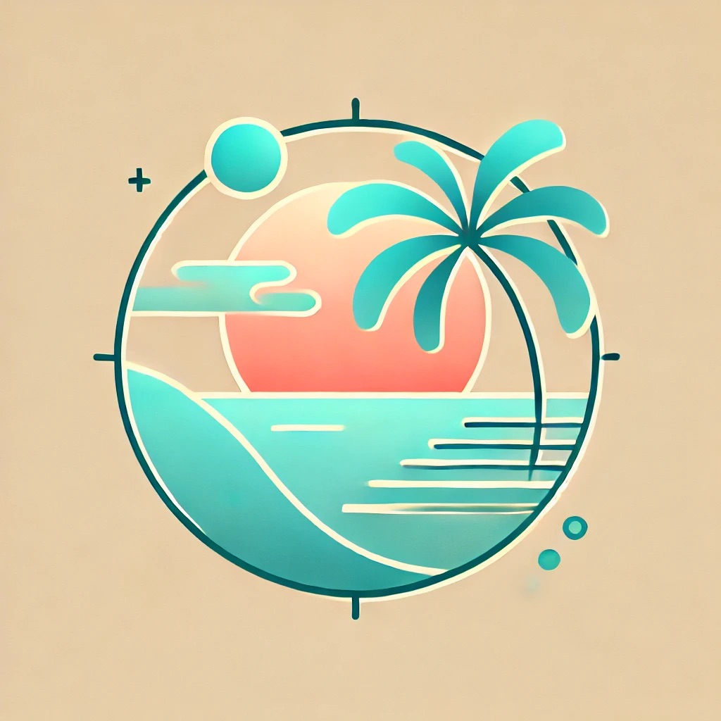
- Option 1: A stylized “T” inside a wave loop
- Option 2: A full-word logotype with a hand-scripted signature
- Option 3: A circle-stamp with a coastal motif and coordinates
- Option 4: A monogram variation using negative space to build a T-shape from wave crests
Each of these were shared with Tammy, alongside mockups—on travel journals, Instagram profiles, and tote bags. That’s where the next round of feedback helped narrow the direction.

3. Colour and Emotion: Why Turquoise Matters
Tammy had one non-negotiable: turquoise had to lead.
We landed on a refined, contemporary palette built from the colours of her inspiration:
- Turquoise Blue (#3EC1C9): The namesake. Represents clarity, adventure, and calm.
- Deep Sea Navy (#17404A): Grounding, authoritative, readable.
- Sandstone Beige (#FEFAF4): Clean whitespace and warmth.
- Seafoam Accent (#B6E2D3): For use in illustrations and background gradients.
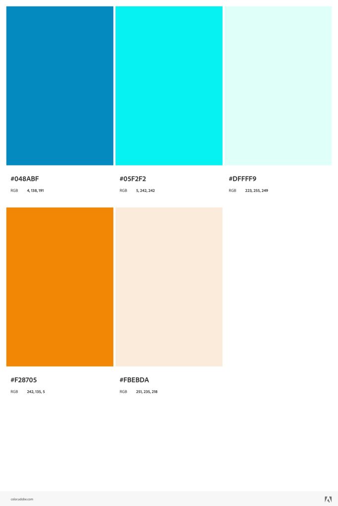
This palette translates beautifully across digital and print. But more importantly—it feels like her brand. Not just bright, but intentional. Not just feminine, but confident.
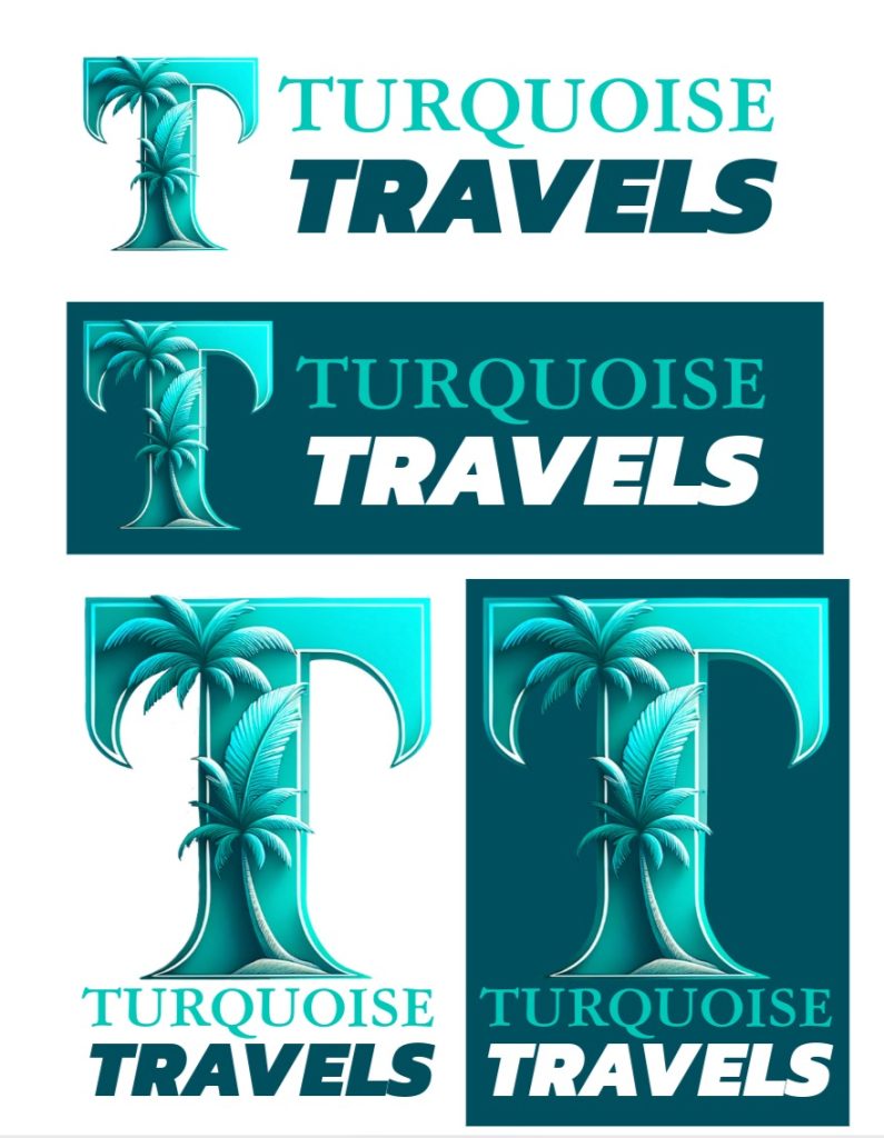
4. The Final Logo: A Signature ‘T’ Rooted in Story
The final logo is a combination mark: a wordmark and an icon that can stand on their own or be used together.

Wordmark:
We used a script typeface that mimics handwriting—something you’d see at the bottom of a postcard. This gives it a personal, journal-like feel. “Turquoise Tides” flows, while “Travel” anchors it in a minimal sans-serif below.
Icon:
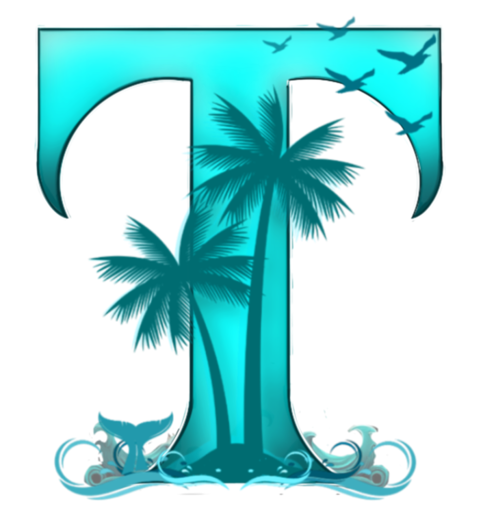
At the heart of the logo is a bold, stylized T—the central feature that unites all three Ts in the name: Turquoise Tides Travel. But it also represents Tammy herself, the founder and heart behind the brand. This wasn’t just about design symmetry—it was personal.
The T is flanked by elements that evoke the Caribbean life she fell in love with: palm trees swaying in the breeze, a whale tail, and soaring birds. These touches speak to freedom, movement, and the raw beauty of the tropical destinations she explores and shares with others.
Rather than relying on trends or abstract symbolism, this logo wears its meaning proudly. It’s tropical, grounded, and deeply reflective of the brand’s values: adventure, midlife transformation, and connection to the sea.
We tested it in:
- Profile photos
- Website headers
- Email signatures
- Stickers and stamps
- Beach hat embroidery
Everywhere it went, it held up. Clean. Calm. Recognizable.
5. Rollout in the Real World
Once approved, the rollout began.
We built a full brand asset kit for Tammy, including:
- High-res logo files in PNG, SVG, PDF
- A simplified brand guide for colours, fonts, spacing
- Instagram templates with the brand mark embedded
- A newsletter header and email footer with the logo locked in
- Adobe Express templates for social promotions
Real-World Use Cases:
- Her Instagram now features the stamp logo as a profile image
- Her highlight icons use wave-line dividers from the branding pack
- Her digital lead magnet features the “T” wave subtly as a footer watermark
- Her upcoming group trips will include branded welcome kits: luggage tags, notecards, and postcards with the logo featured
We also mocked up possible uses for future merchandise—travel mugs, sarongs, or notebooks. This was about more than “just a logo.” It became a system.
6. Emotional Branding: What the Logo Really Represents
What makes a good logo work is never the visual. It’s the connection.
Tammy’s brand isn’t selling travel. It’s selling a feeling: liberation, curiosity, and rediscovery. Her audience is women who’ve raised families, cared for others, and now want something of their own. They don’t just want luxury—they want meaning.
So this brand needed to feel personal. Not corporate. Not glossy. It needed to feel like a friend who says, “You’ve got this. Let’s go.”
That’s what we do at ShiverMedia. We don’t just build logos—we translate emotion into identity. We build the visual vocabulary that lets your people find you.
7. Cross-Channel Consistency: Same Brand, Many Touchpoints
Here’s where most small brands fall apart: inconsistency.
They get a logo, throw it on a few things, and move on. But your brand is only as strong as your weakest visual link.
For Turquoise Tides, we made sure the identity extended across:
- Instagram: Posts, stories, highlight icons, bio links
- Email Marketing: Branded banners, CTAs, and signature footers
- Client Docs: Itinerary PDFs, trip agreements, intro kits
- Print: Stickers, bag tags, and printable postcards
- Website: Cohesive typography, favicon, colour-coded CTA blocks
We built her a flexible system. Now, every time Tammy shows up online or in a client conversation, the visual language is seamless. Her brand builds trust because it feels professional—and that trust converts.
8. Final Thoughts: Why Visual Identity Matters More Than Ever
In 2025, your logo is often the first handshake people get with your brand.
But even more than that—it’s your anchor. It’s what holds the rest of your visual presence together, especially as your business evolves.
For Tammy, Turquoise Tides Travel is just beginning. But she now has a brand that reflects who she is, what she values, and who she’s here to serve. And every time she sends a client email, posts an Instagram Reel, or hands someone a branded card—she’s reinforcing that identity.
That’s the power of visual storytelling. That’s what ShiverMedia brings to the table.
Want a Brand That Tells Your Story?
If you’re launching a business, side hustle, or passion project and your visuals don’t yet match your vision—we can help.
At ShiverMedia, we specialize in:
- Logo and identity design
- Full brand kits and asset rollouts
- Social media branding
- Content and design templates
- Emotional, conversion-driven storytelling
Let’s build something that feels like you.
Work With Us or reach out directly to start your brand journey.
Designed by ShiverMedia. Inspired by turquoise waters and the women who wander.